
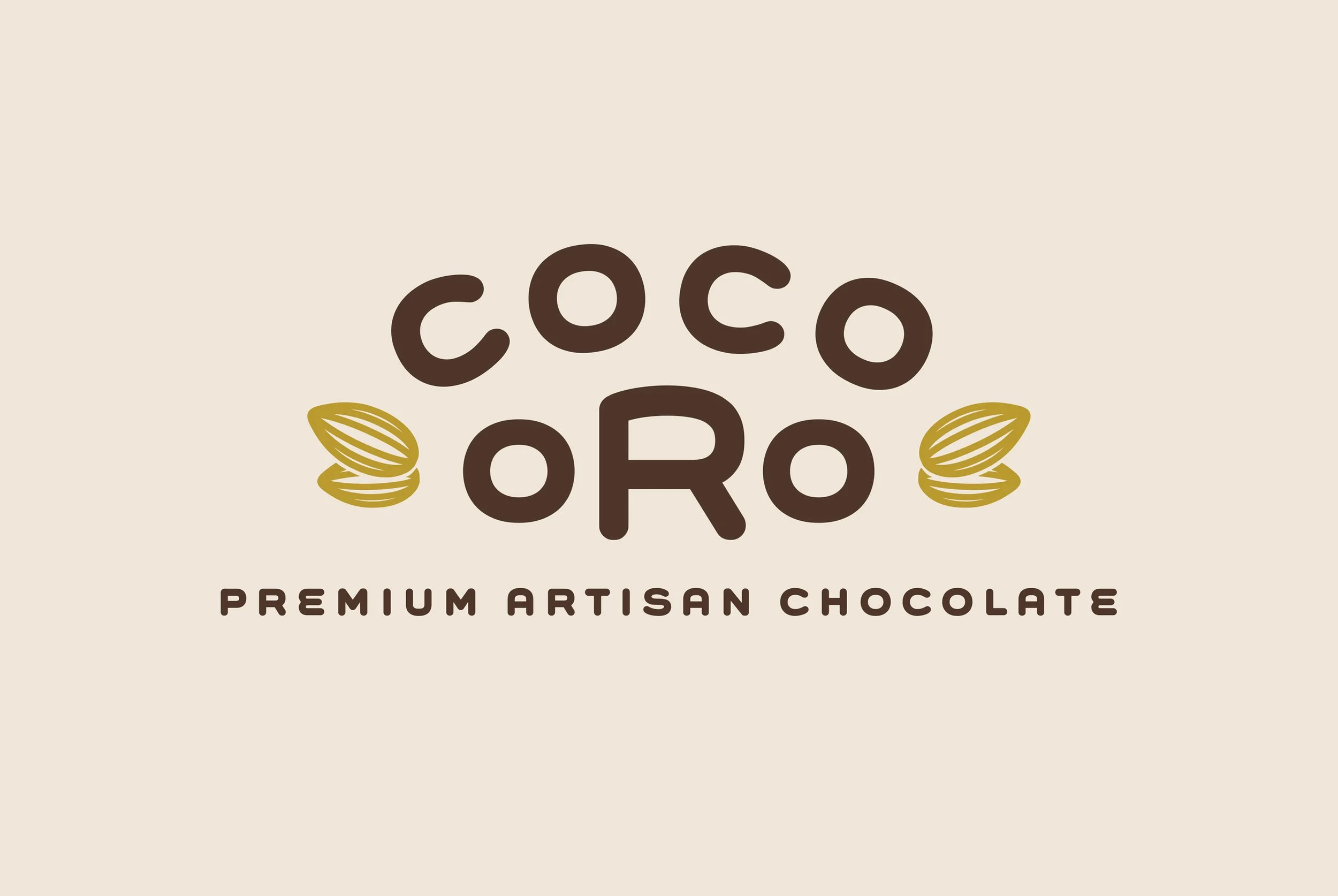
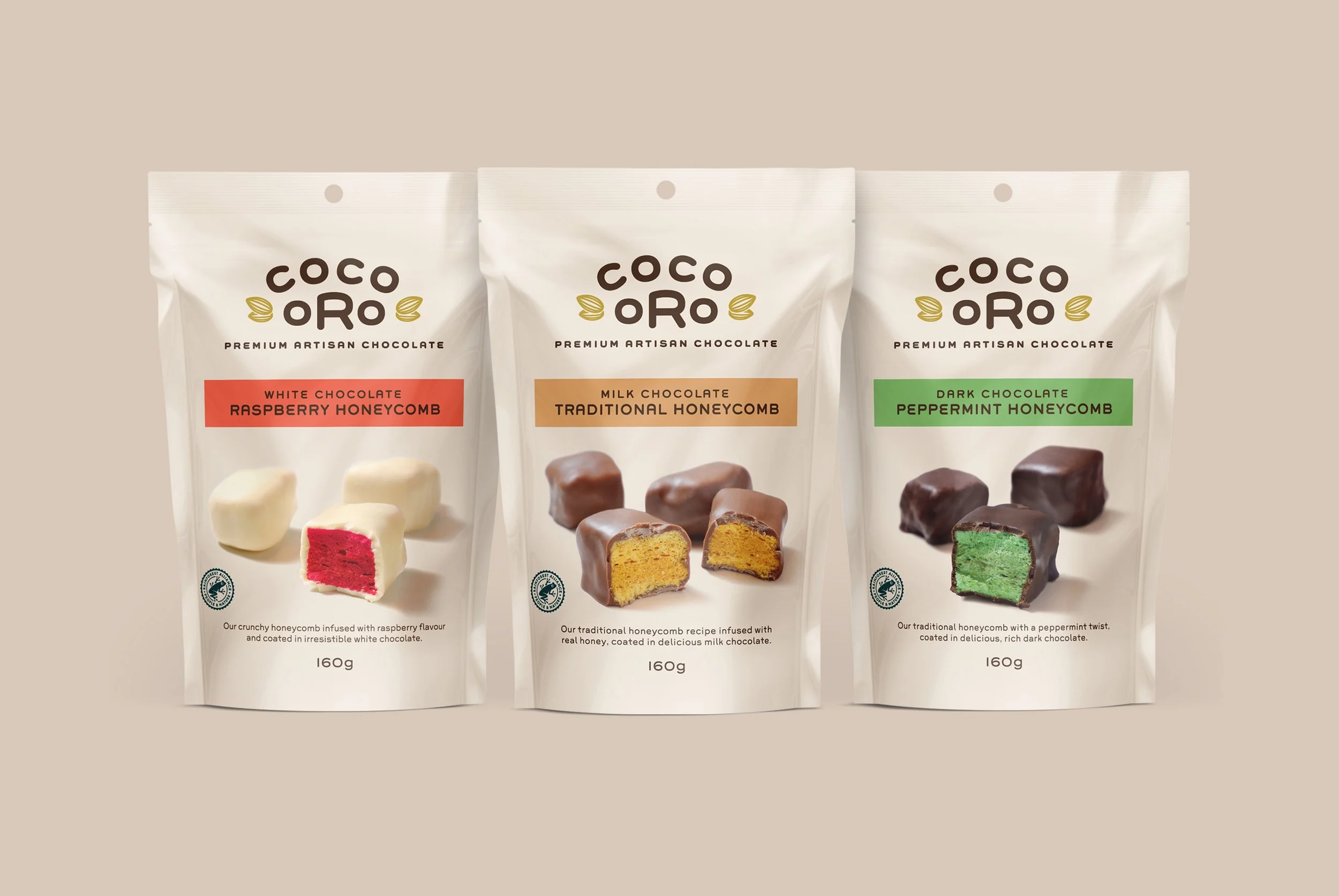
Coco Oro honeycomb
Brand naming, brand mark development, packaging, copywriting
This is The Confectionery House’s first foray into premium chocolate. We firstly gave it a name. Our naming process led to the use of two simple rhyming words that perfectly express ‘premium chocolate’ in a catchy and unique way.
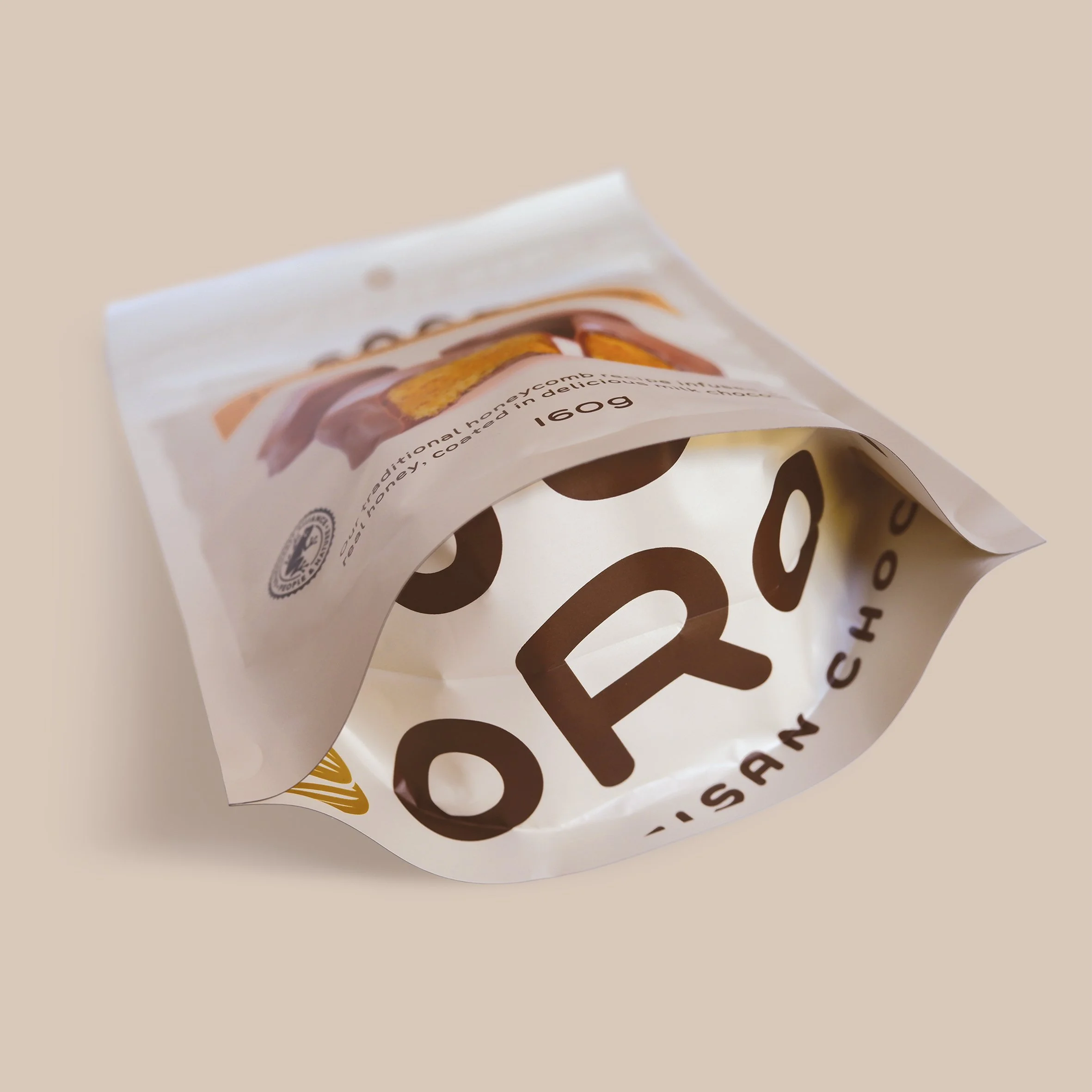
We then designed brand mark and packaging for this high-end chocolate honeycomb range. The brand is positioned as an artisan challenger brand – it’s point of difference being that it’s a contemporary, locally made offer with ethically sourced, high quality ingredients made using traditional, artisanal methods.
In bringing the brand and packaging to life, we used a minimalist and elegant aesthetic, deliberately juxtaposing traditional graphic style with a single, modern font. The bold and uncluttered product photography makes it the hero of the pack and ensures that taste appeal is the key motivator in consumer purchase intent.