
The Confectionery House Honeycomb
Brand positioning, brand mark development, packaging, copywriting
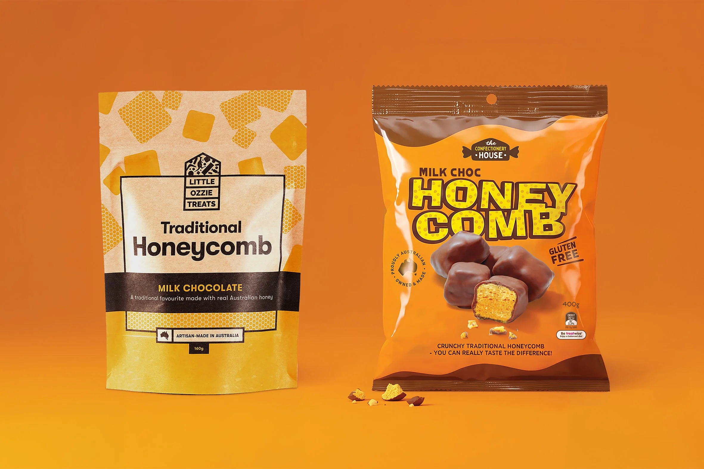
A major part of our redesign of The Confectionery House’s brand and packaging was refocussing on honeycomb as a core brand offer - one of their manufacturing strengths and, with few competitors, a product with the greatest potential. Not only were we creating a new ‘honeycomb’ brand, we were evolving The Confectionery House into a proud, trustworthy endorser, under which future ranges can also sit.
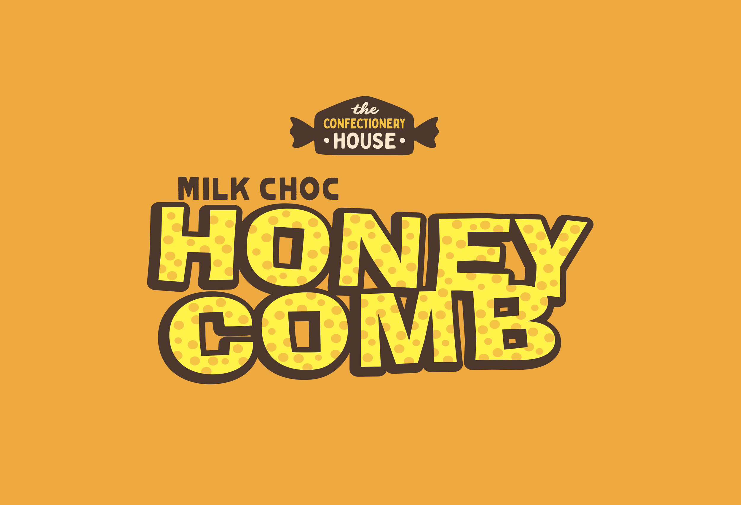
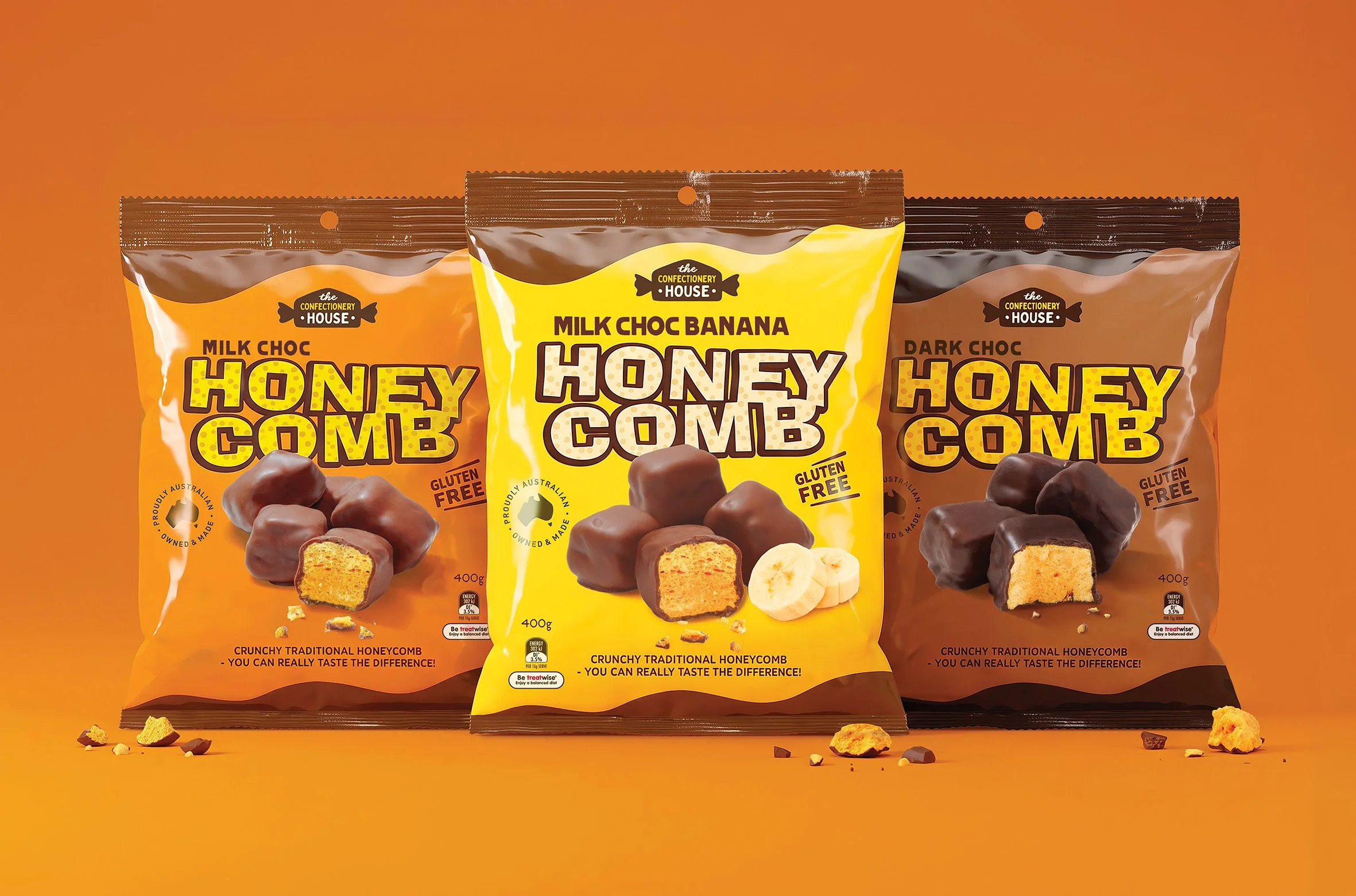
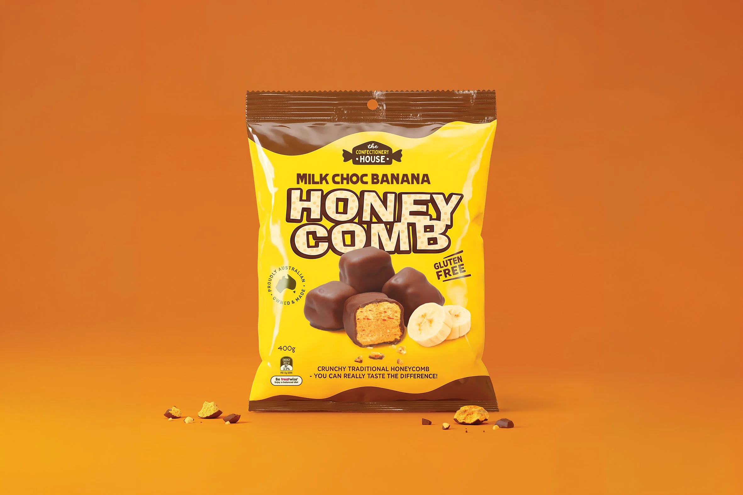
The Honeycomb brand mark is designed to represent the product – a fun, stylised depiction of honeycomb where the letterforms themselves are choc covered honeycomb, bold enough to be able to subtly change colour depending on variant flavour. The overall colour strategy of the packaging also reinforces each variant through representation of flowing milk or dark chocolate ends, and vibrant base colours.
The depiction of the product is deliberately casual, almost messy. No pretention here, just tip ‘em out and get into ’em!