
Infuzions snacks
Branding, packaging, copywriting, point of sale, merchandise
We partnered with Australian snack food company Majans on a strategic repositioning and rebrand of their Infuzions snack brand, designed to elevate the brand’s presence on and off shelf, broaden their appeal with health-conscious consumers, and bring distinctiveness and desirability to a crowded retail category. Described by Majans in press releases as "the biggest brand evolution in our recent history", this was a huge leap forward for the brand, and one that was sorely needed.
Having had the same branding and colour pallet for decades, our task was to bring this brand up to speed - to meet current consumer expectations, to align with Majans plans for the brand, and to better express its USP.
Firstly, the brand’s positioning was out of sync with its visual expression, and with current snacking trends. Going back to the drawing board, we repositioned the brand to be more heroic, forward thinking and positive, focusing more on the genuine benefits consumers get from the brand.
Snacking has become more permissible, more health conscious, an any time of day need state, and less associated with socialising. In response to this change, we built a brand story around permissibility, wellbeing and connectivity. Also, the balance between taste and health has never been more important, and played a big part in the development of the new Infuzions positioning and tone of voice. The result is a proud, spirited, trustworthy brand with a positive, forward looking attitude and a dedication to providing genuinely healthy snacks.
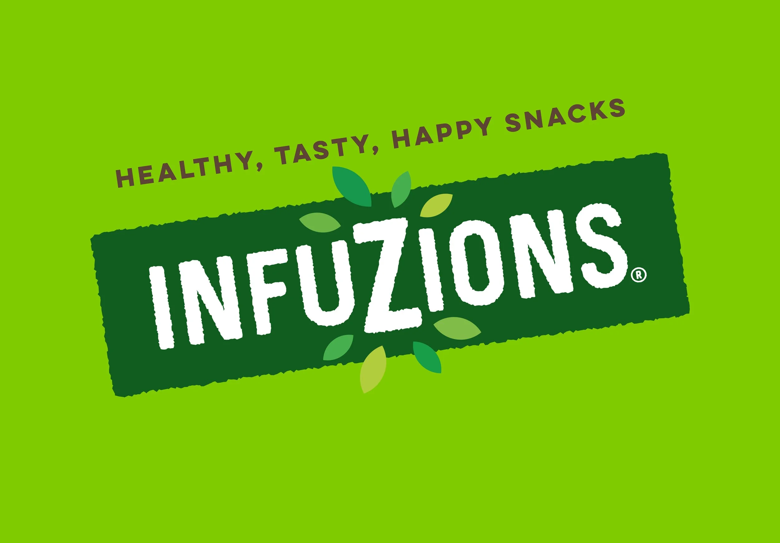
Indicative of this change in positioning is the updated tag line – from “Naturally light & tasty” to “Healthy, tasty, happy snacks”. This is a subtle yet crucial shift in brand personality and tone of voice. The brand is now in the business of not just providing healthy snacks, but of making people happy!
The geometric, elegant nature of the brand mark didn’t suit where the brand needed to be, and certainly didn’t meet current consumer expectations of a snack category brand. As a way of evolving this mark, in the loosest sense of the word, we retained the enlarged Z letterform, applying it to a new, freer, more fun and dynamic brand mark. Applying a halo of leaves around the Z immediately expresses the brand’s healthy positioning, as does a colour pallet of different shades of green. Typographically, we evolved a personality-less, hard edged font into a loose, slightly distressed one that now conveys the texture of a crunchy snack and enhances the sense of fun and enjoyment that the brand promises.
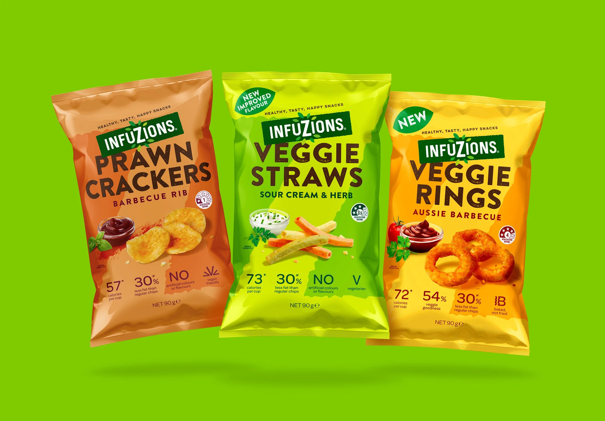
Resolving the tension and complexity of the messaging hierarchy was also a critical step. We started by removing the parent company logo which, for a brand with as much free-standing equity as Infuzions, was not adding any value. Then we developed a simple but effective lockup between brand and variant that has a comfortable hierarchy and allows both to be prominent without fighting. Not only is the communication clearer but standout is also greatly improved.
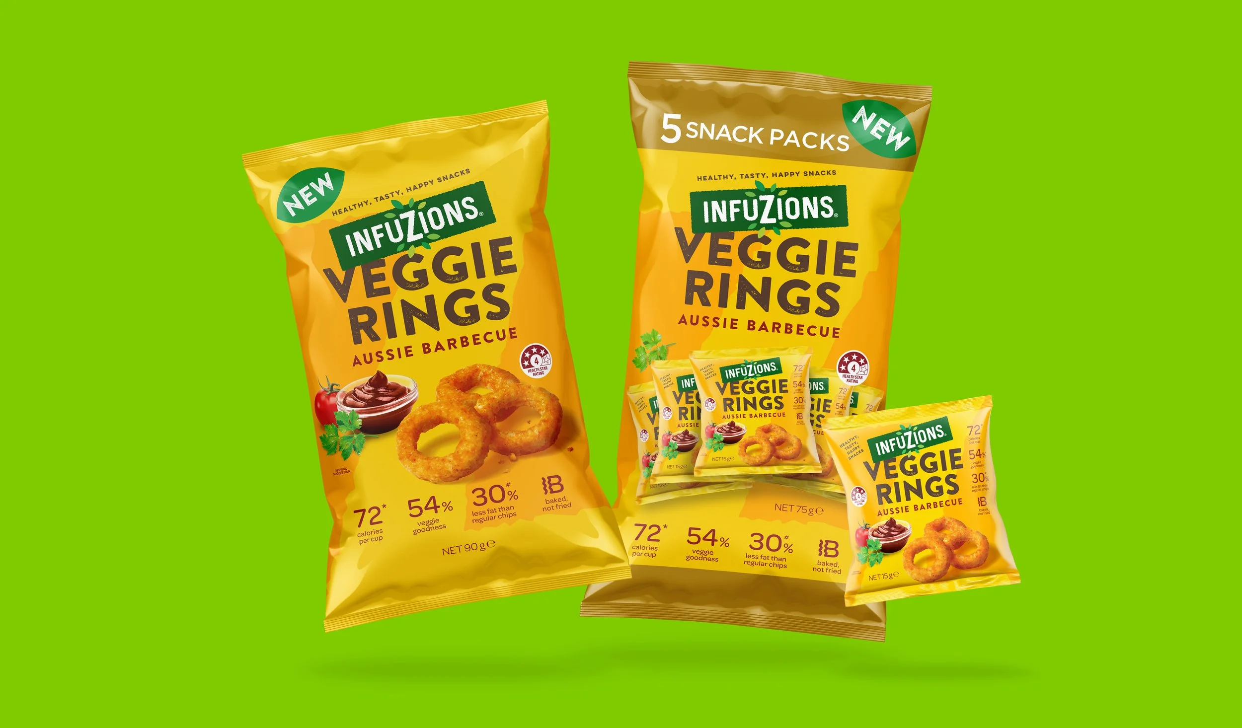
To add greater synergy between brand and pack, we took the enlarged Z and used it as a tonal variation of each base variant colour, creating a bold and distinctive brand asset that gives the range a unique, ownable look on shelf. We also changed the product imagery to be less fussy, less structured and more intimate. This approach heroes the product and improves taste appeal.
By far the biggest change that we made to the brand was updating their packaging colours. This issue goes to the very heart of the challenge of meeting consumer category cue expectations versus standing out from your competitors. Infuzions had been held back for decades by a brand positioning that insisted that the brand owned dark colours. Yes, there was a degree of uniqueness to this, but at the cost of the brand feeling fun, bold and energised – key purchase intent drivers in the snack category. Updating to a new, bright, lively colour pallet has repositioned the brand as a serious, healthier contender to the market leaders.
Overall, the improvements to how the brand speaks and it’s on shelf presence are dramatic. The brand now has a confident, engaging voice and a positioning and graphic system that will carry the brand into the future.