
Buster Chunks ice cream
Brand positioning, brand mark development, packaging design, copywriting, advertising
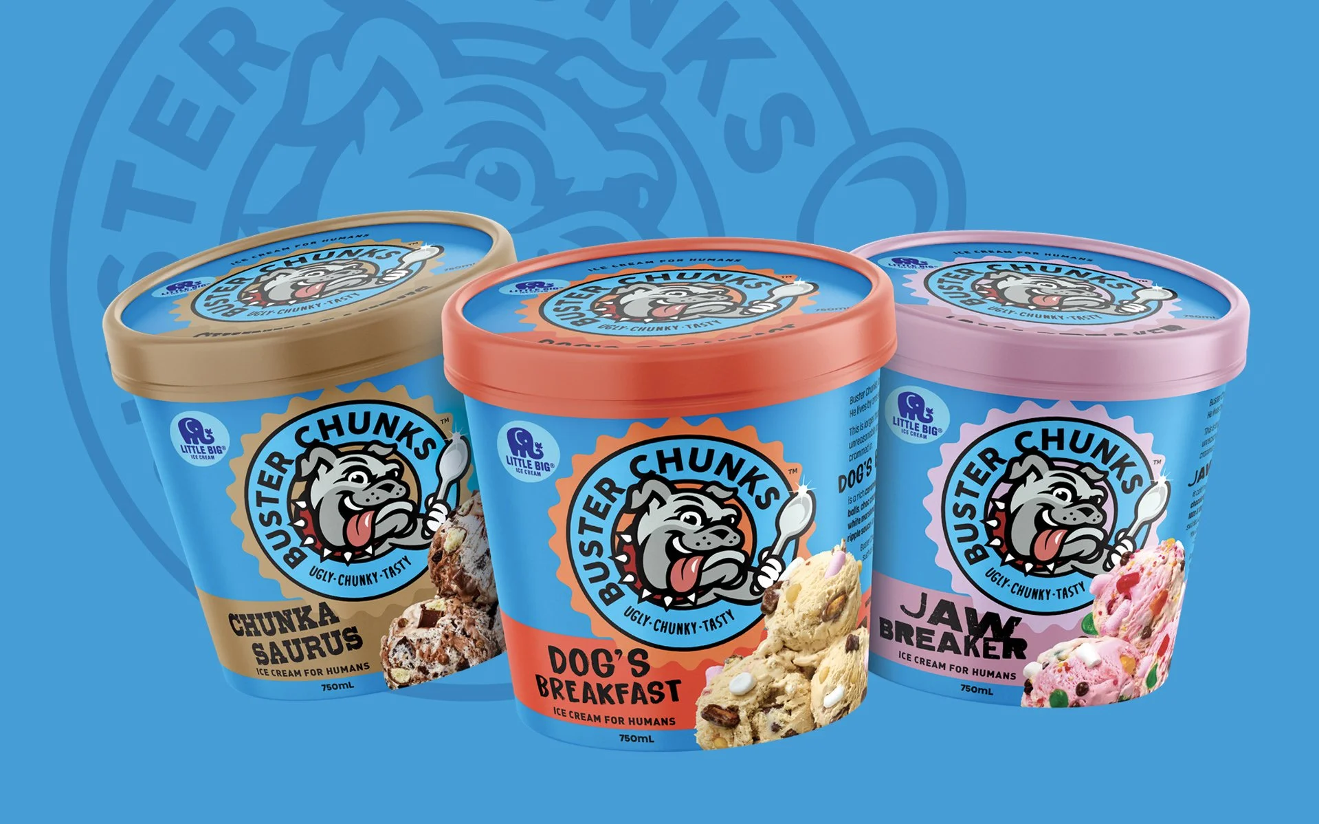
For their first branded product range, the Little Big Ice Cream Company went all in! Buster Chunks isn’t dancing around indulgence – it’s diving right in with a brand proposition centred around big, chunky inclusions, and lots of them. This is a loud and proud brand, described in the comms we developed as “larger than life, face first ice cream, overloaded with outrageous inclusions and unapologetically fun flavours”.
Obviously, a personality-led character brand mark was required, so Buster the bulldog was born. This brand mark was designed to not only capture the spirit of this inventive, over the top brand, but also to be profoundly different to any other ice cream brand in the Australian market. It’s vibrancy, scale on pack and slightly retro ‘that’s all folks’ style, make this packaging unmissable, and unforgettable.
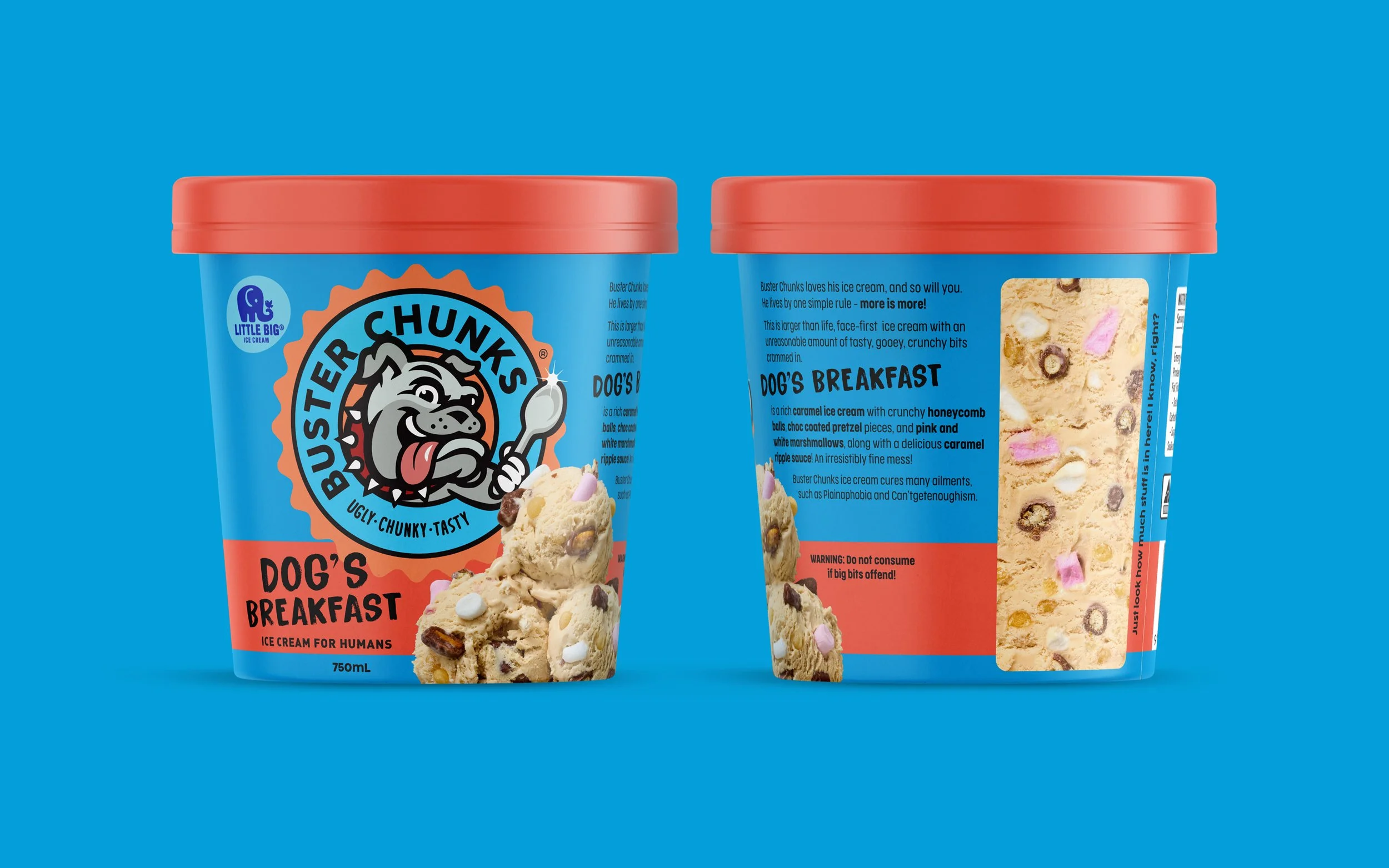
The Buster Chunks tone of voice is of course confident, brash and full of wit. We brought this to life in on-pack copy and throughout comms and advertising material. We also put a cross-section image of the contents of each tub on the side, to reinforce just how many inclusions are in there.
Oh, and the ice cream is incredible!