
Pop Tops fruit juice drink
Branding, packaging, copywriting
In the kids lunchbox category, it isn’t enough to engage only with parents through permissibility. Today’s brand-savvy kids will quickly let their parents know if they don’t like a brand. The first thing we realised when asked to redesign the Schweppes Pop Tops brand was that, for a brand that needed to appeal to kids, it was failing. It’s positioning implied that it was a brand that kids love, so our redesign began with that key objective.
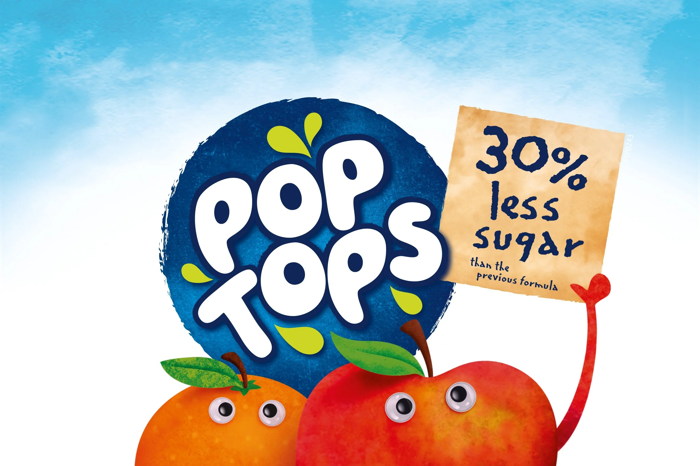
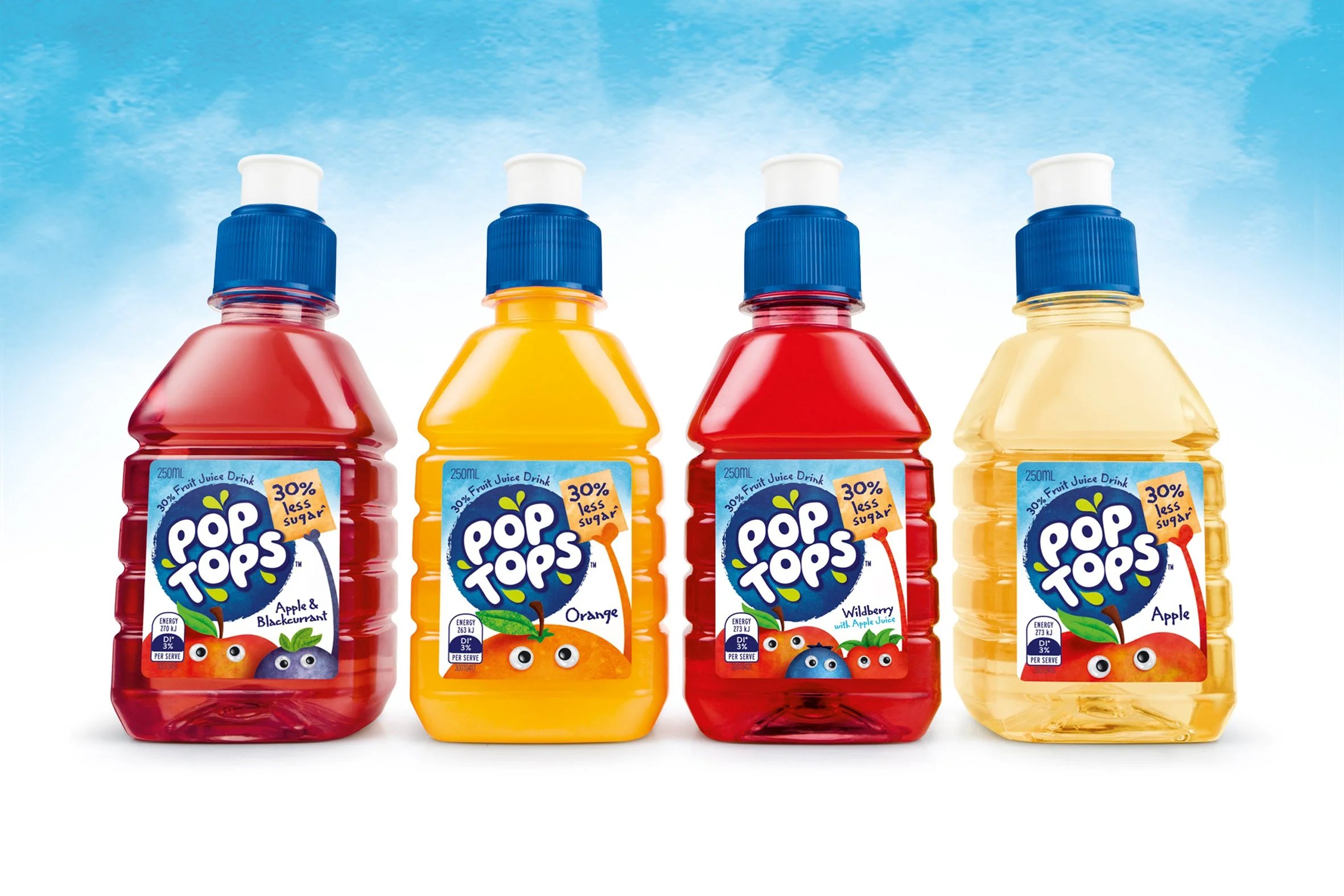
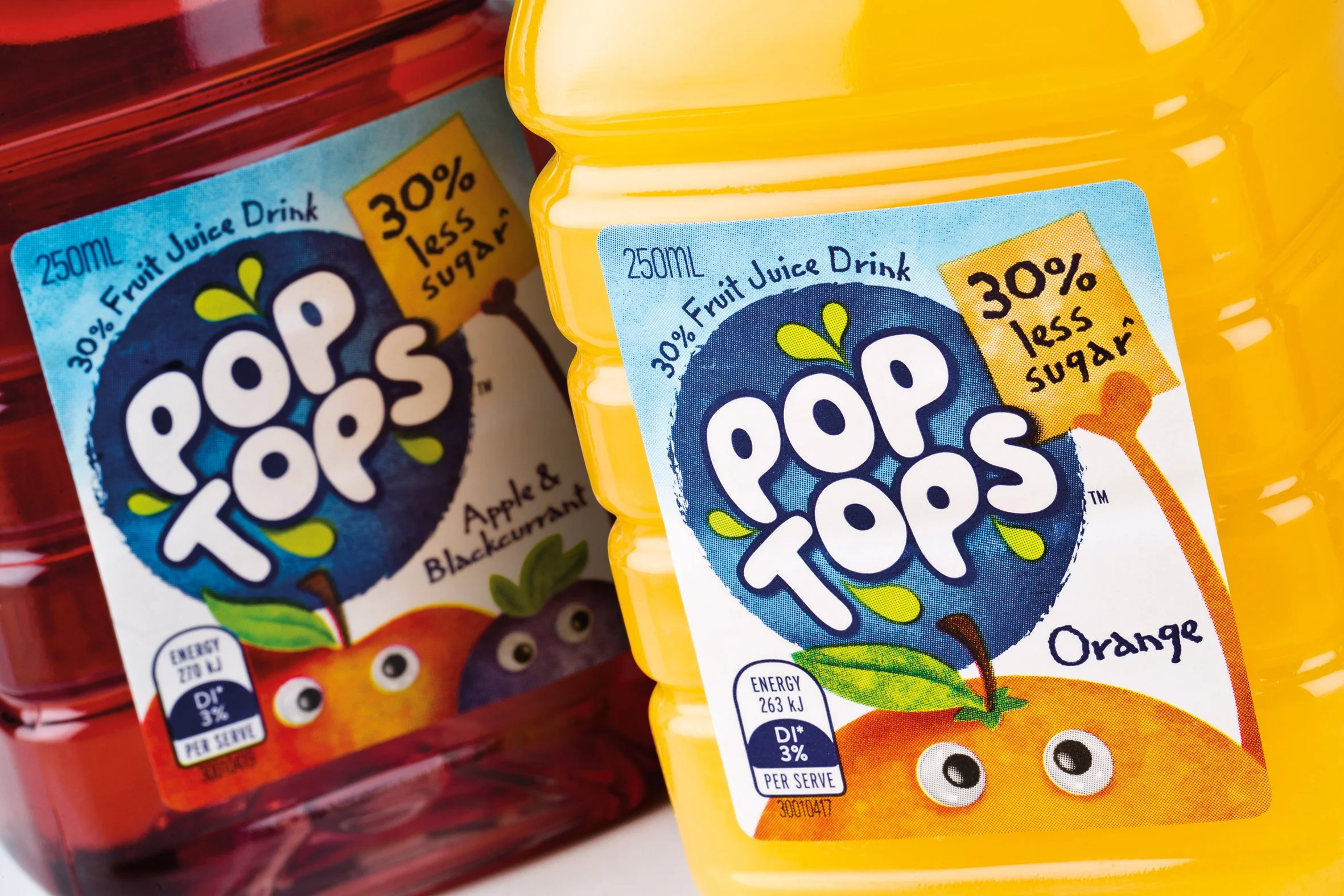
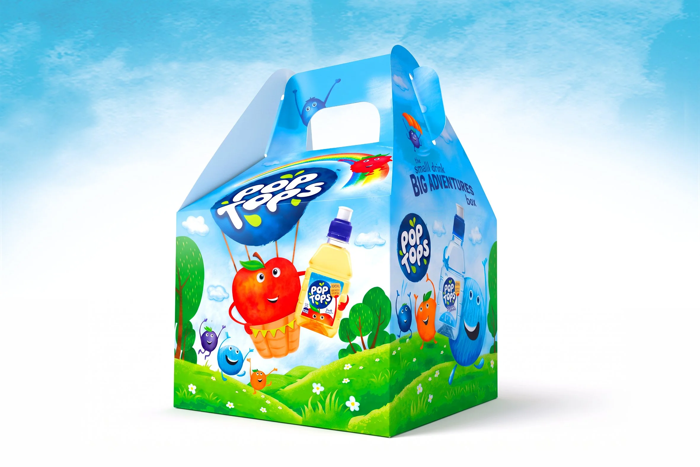
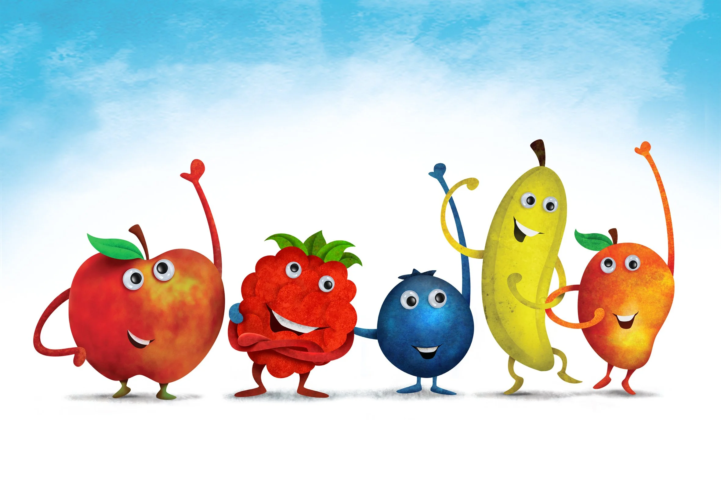
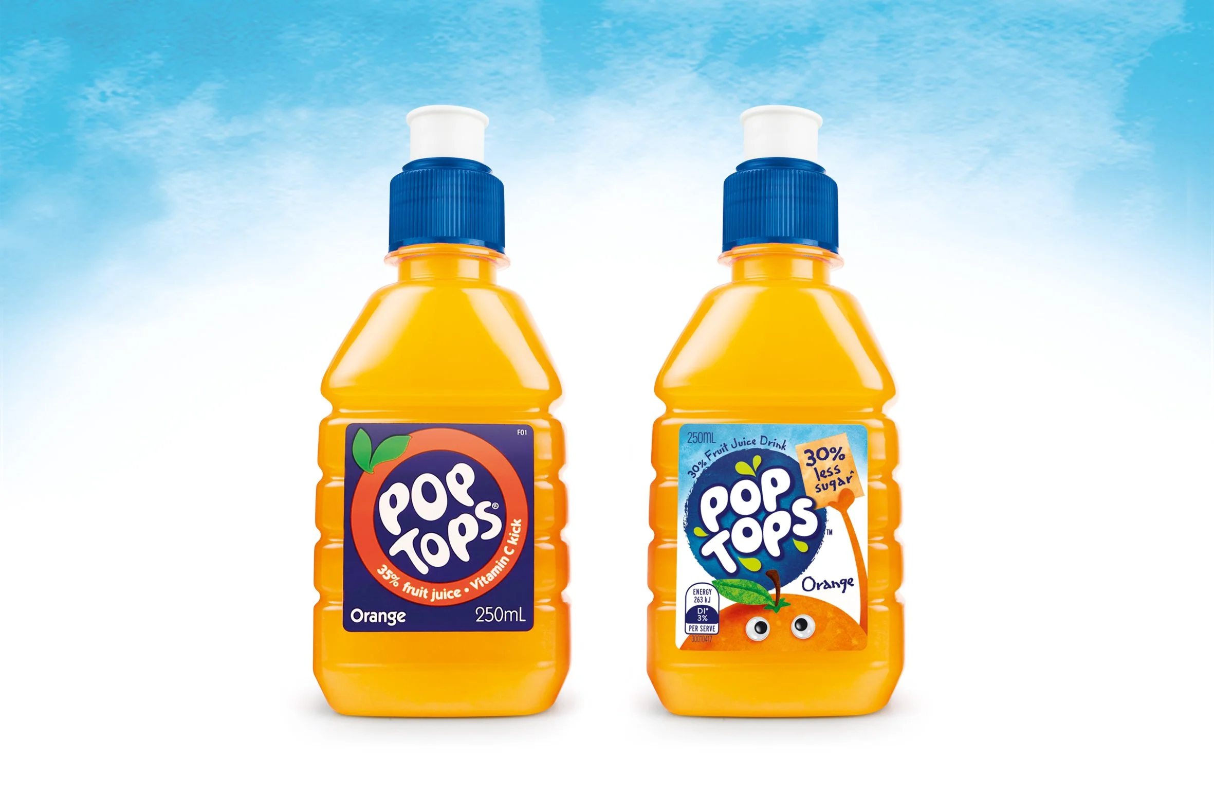
We redesigned the brand mark in a way that still referenced the previous mark, but with more character and personality. We then created an orchard-full of characters to really bring each variant to life. These characters became the fruity, fun essence of the Pop Tops brand and were used extensively in all marketing, merchandising and advertising. The characters on pack are even helping to make the brand’s health benefit more prominent.
Overall, a lighter, brighter leap forward for the brand.
This redesign and promotional campaign led to a 9% sales increase in the first year.