
The Pet Project
Natural Treats
Branding, packaging, copywriting, illustration
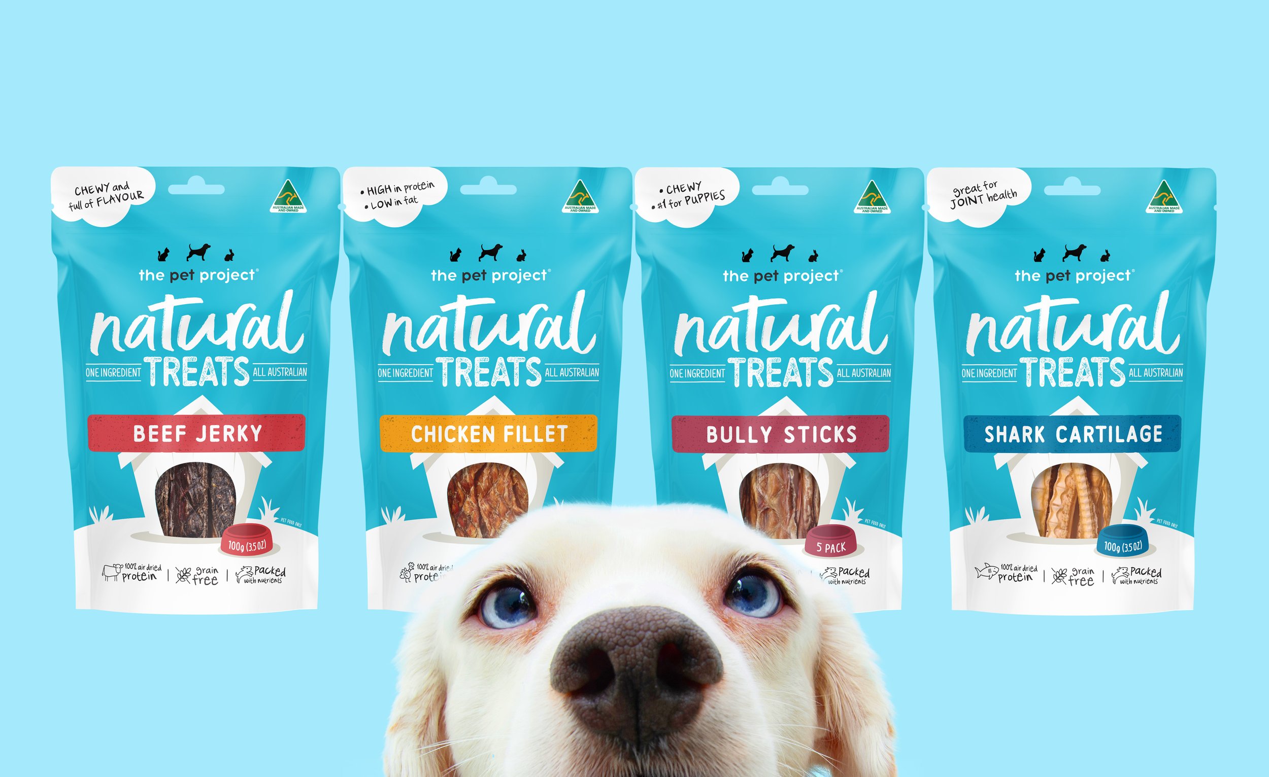
The Pet Project’s Natural Treats range needed to stand out in a highly competitive and rapidly expanding market. Natural Treats however have a key point of difference. Every product is made from only one single ingredient – just one simple animal protein.
Our redesign needed to not only improve the communication of this important health benefit, but also add more personality to the brand; to tell a more engaging and fun story of pet owners’ love for their pets and the importance of a healthy diet.
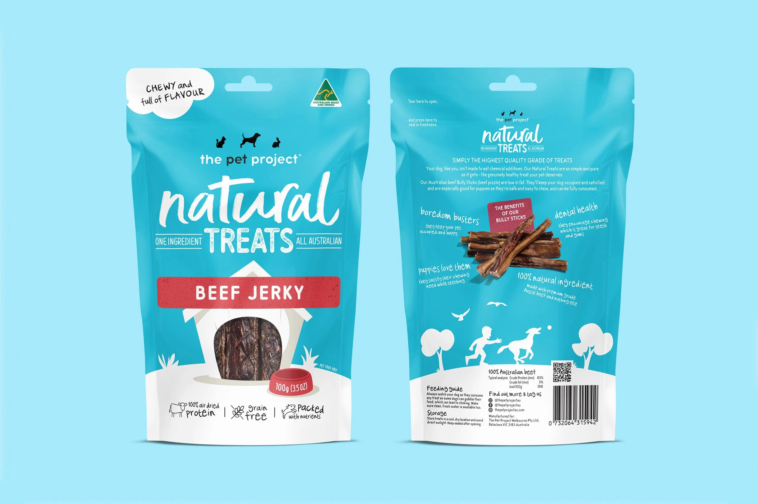
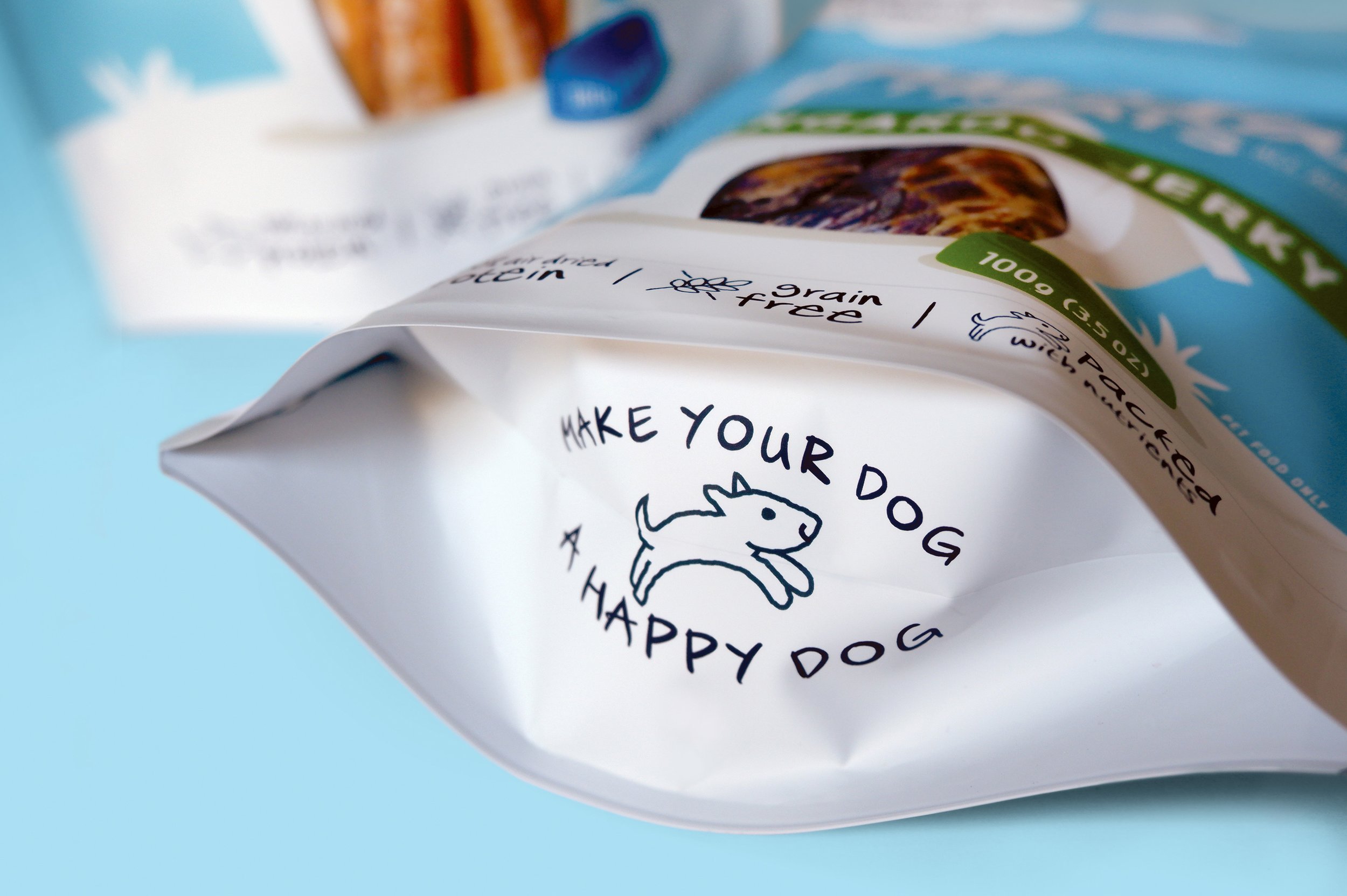
The previous two years that this range had been in market meant it had some existing equity so retaining the brand’s primary aqua colour was a no-brainer. We developed a stronger tone of voice for the brand and a consolidated illustrative story that incorporates a view of each product in a fun way. We extended this look and feel across both front and back of pack, and even the base of the pack so that if it falls over on shelf, it’s still going to grab your attention.
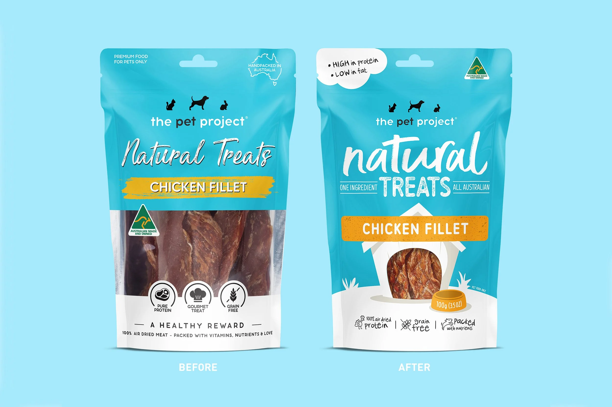
We also created a more modern and dynamic typographic lock-up for the Natural Treats brand mark that feels more confident and unique.
This new packaging is still unmistakably the same product, but now with a far more engaging tone of voice.