
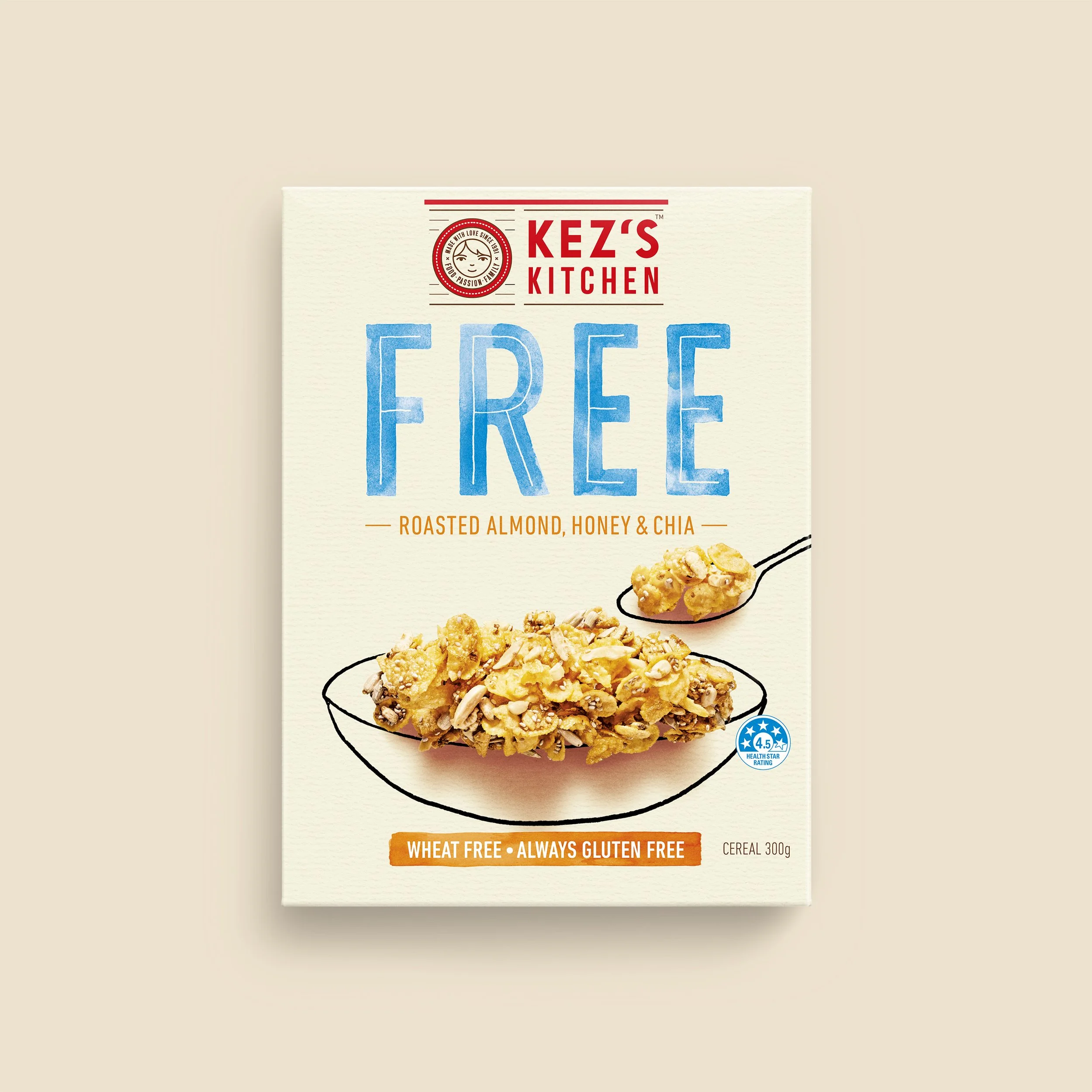
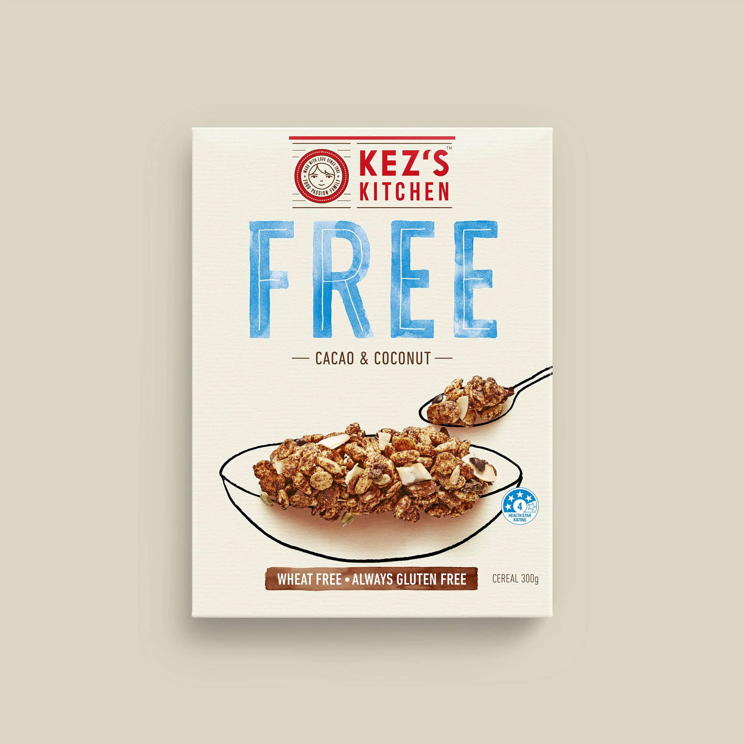
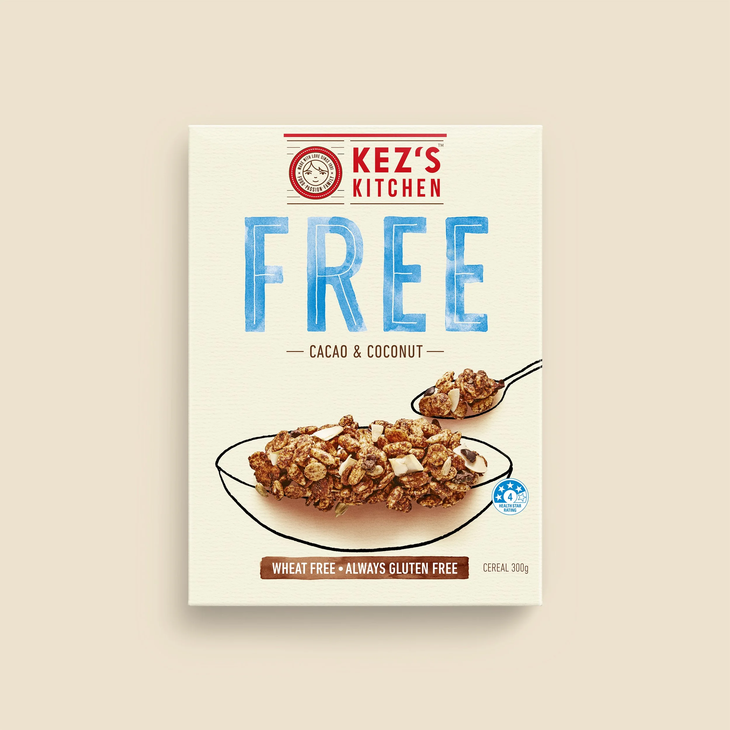
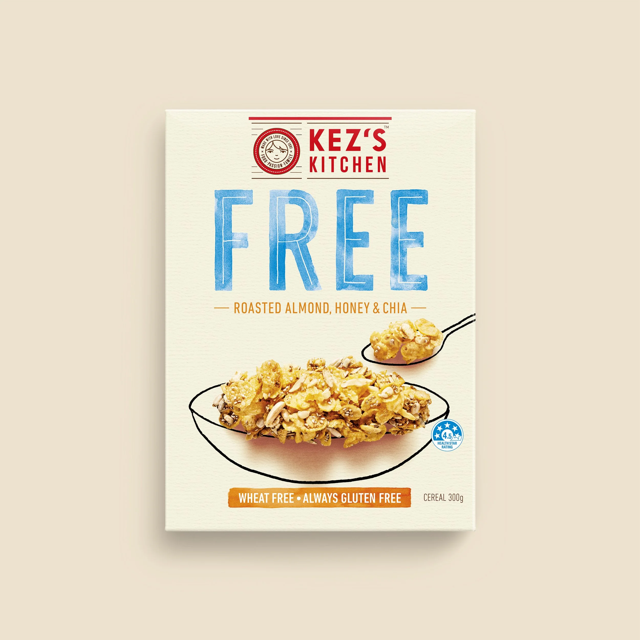
Kez’s Kitchen Cereals
Branding, packaging, copywriting, illustration
The Kez’s Kitchen brand had grown so quickly that some inconsistencies had crept into their packaging, and on shelf, their brand attributes were getting lost. Time for an overhaul.
Kez’s Kitchen pride themselves on the fact that they have always been a family-run business. They go out of their way to ensure that the hand made nature of their products is never compromised, even when their manufacturing processes are scaling up.
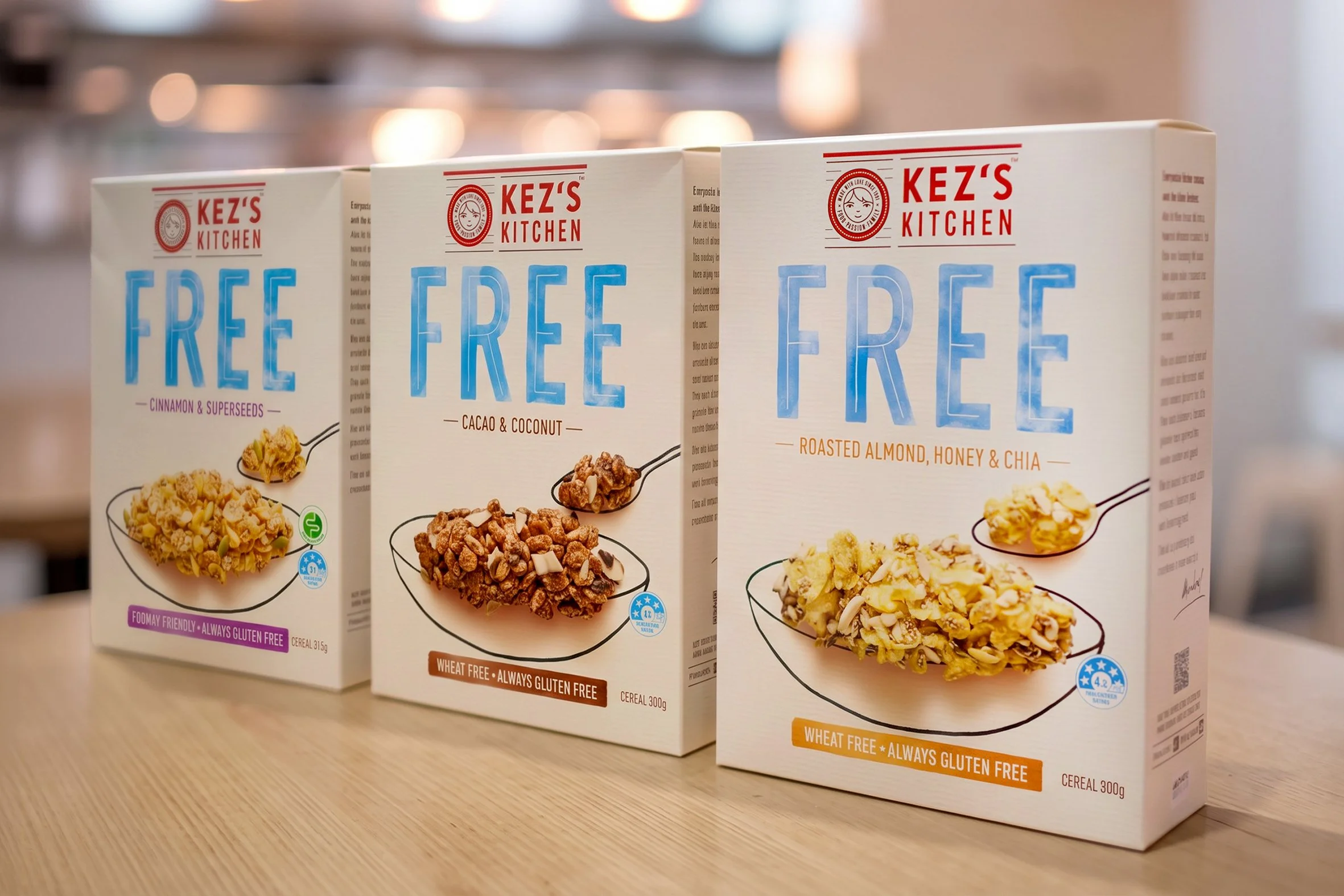
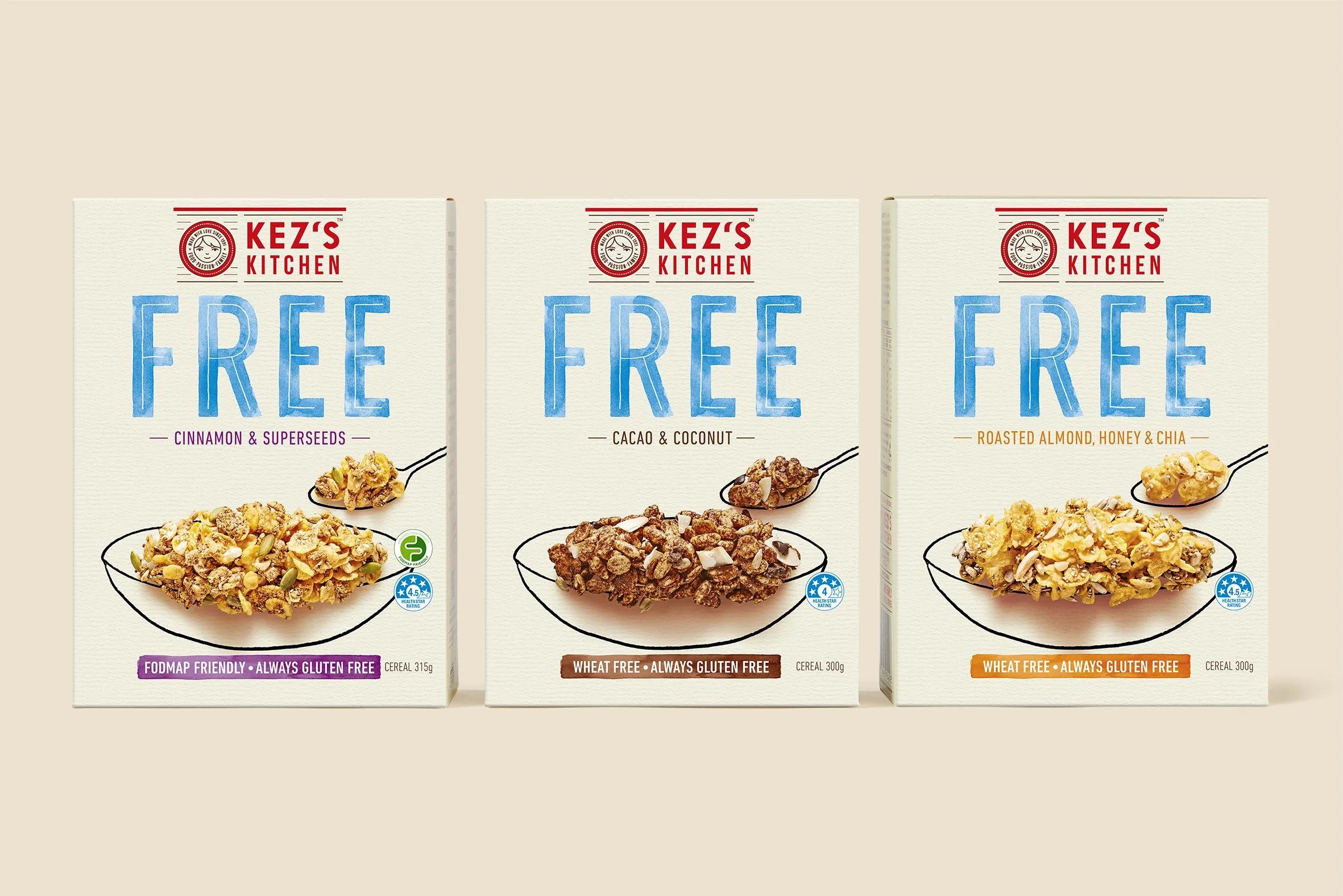
We evolved the brand mark, then redesigned their cereal packaging to be more brand-led, ensuring that it expressed to consumers their spirit of genuine, hands-on care and quality.
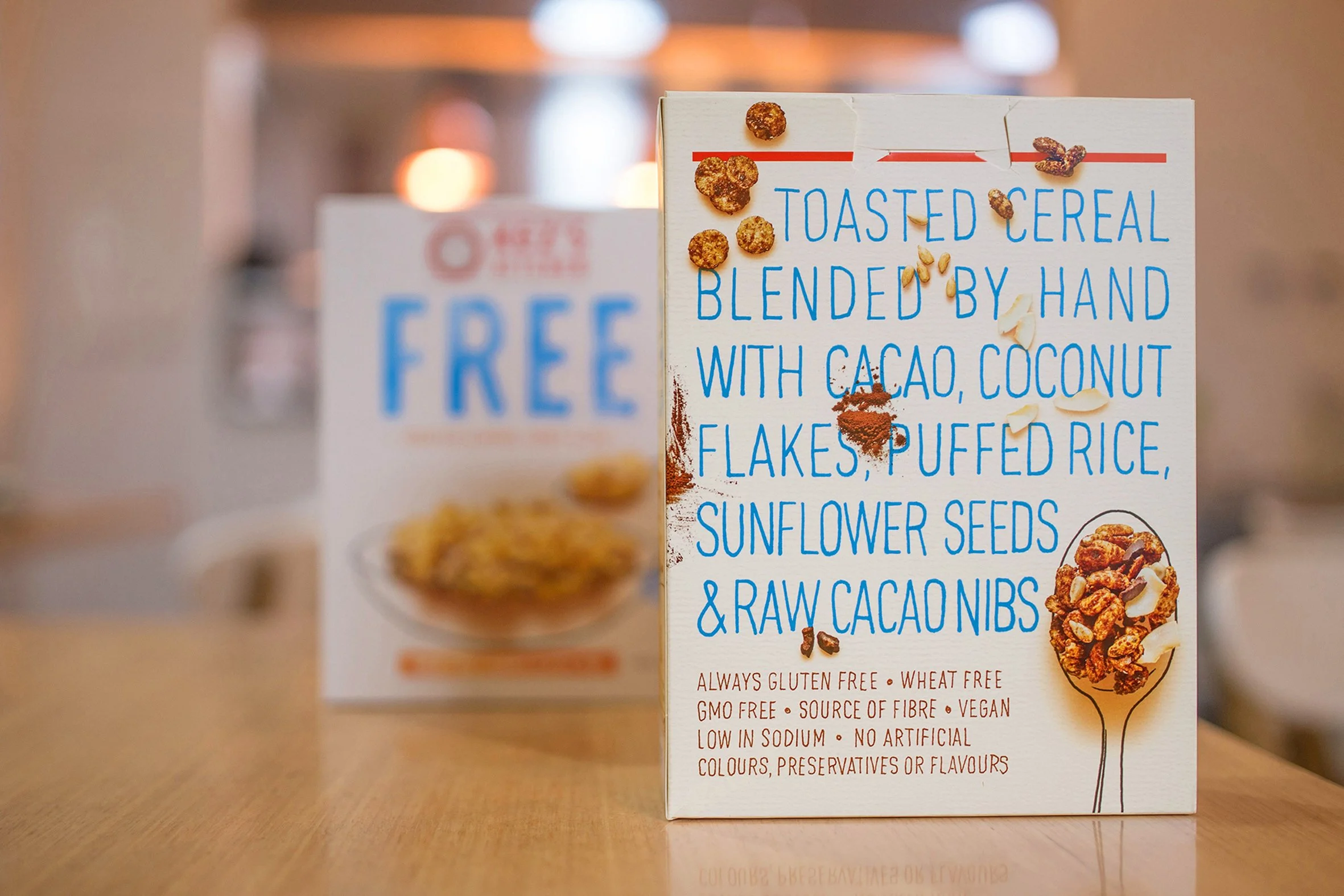
This bold modernisation of the Kez’s Kitchen brand and packaging using hand-drawn typography and illustration perfectly captures the essence of their brand and the artisanal quality of their products.