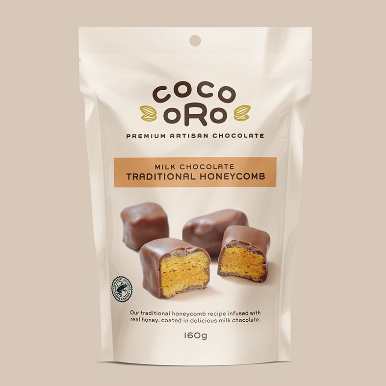
Coco Oro
Brand Naming / Brand Identity / Packaging
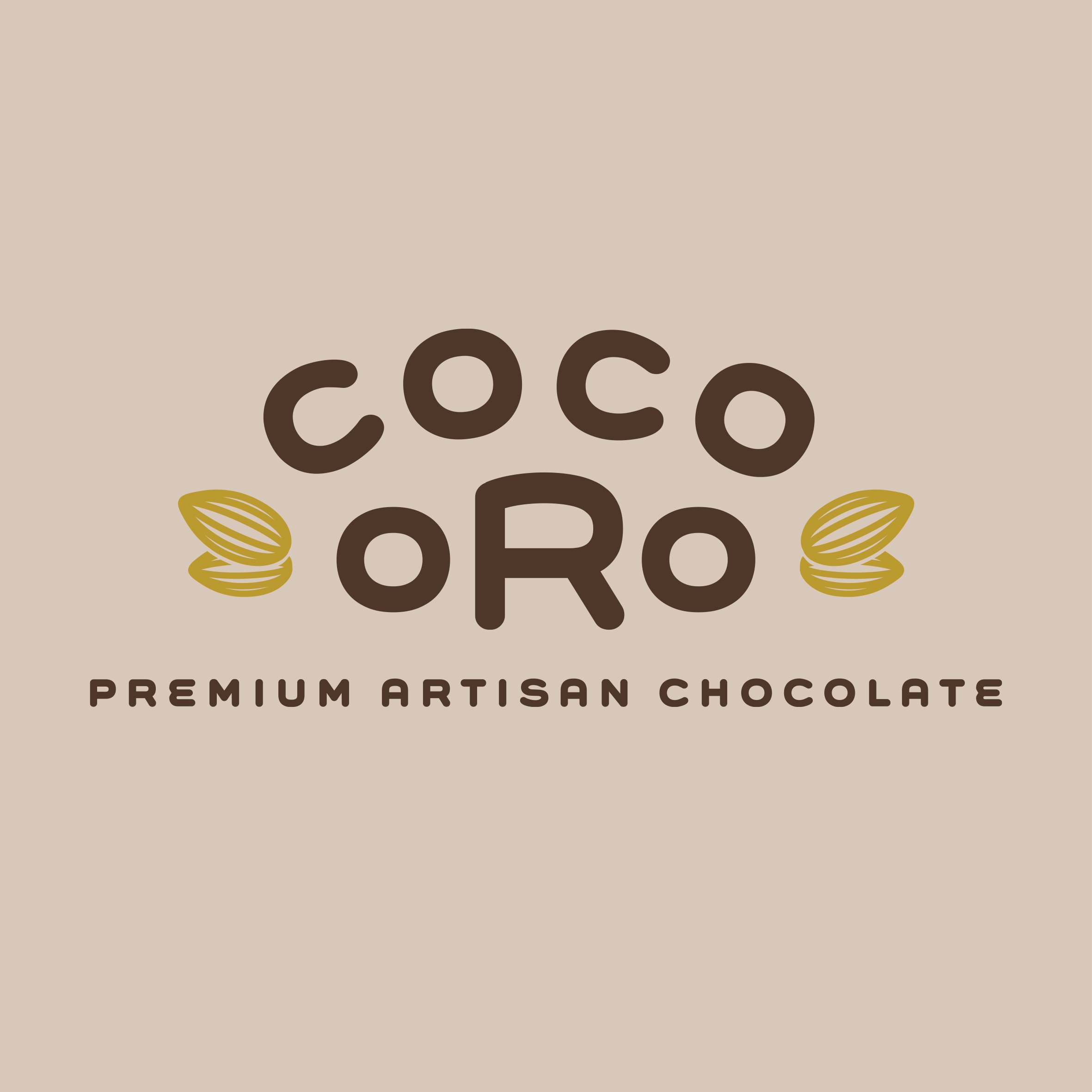
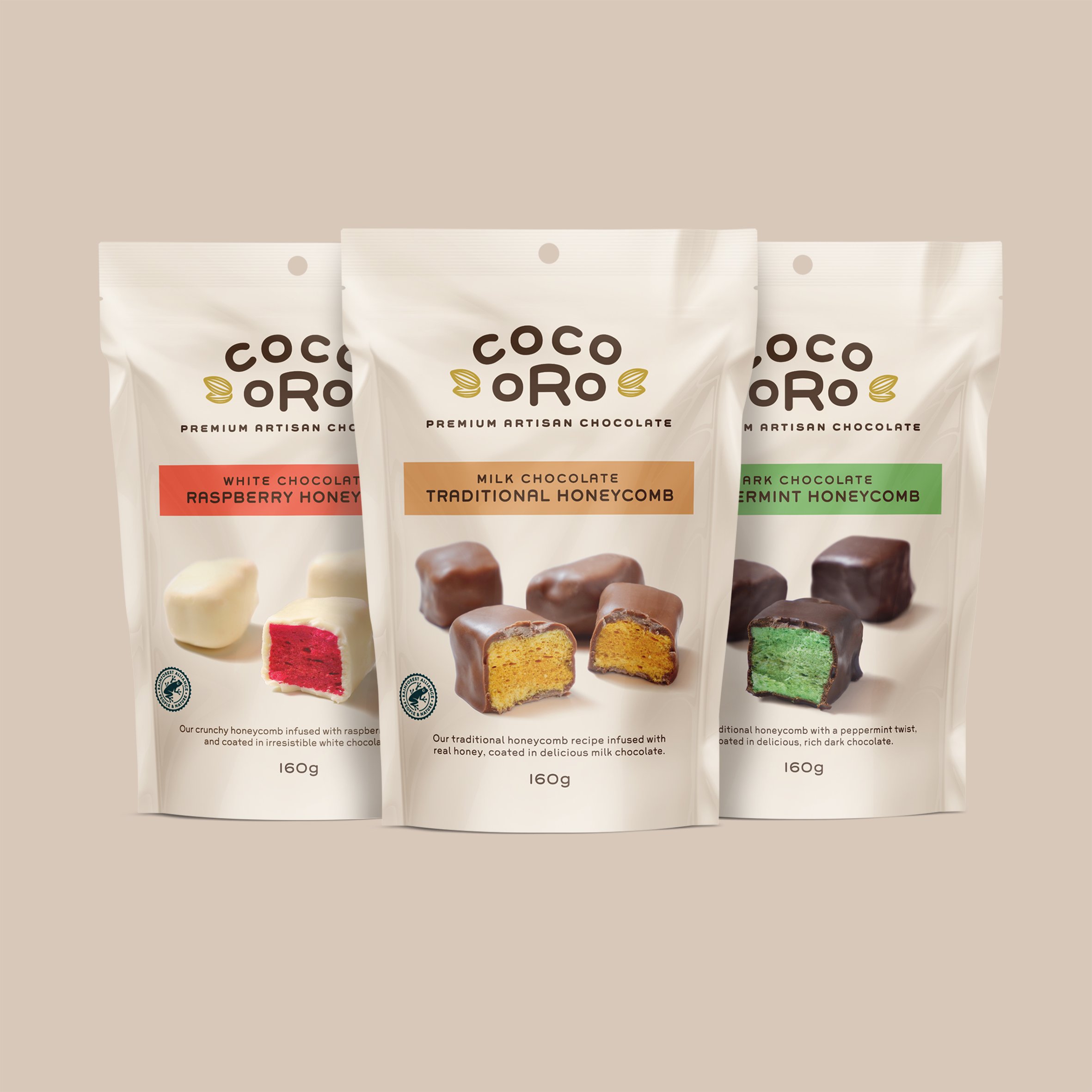
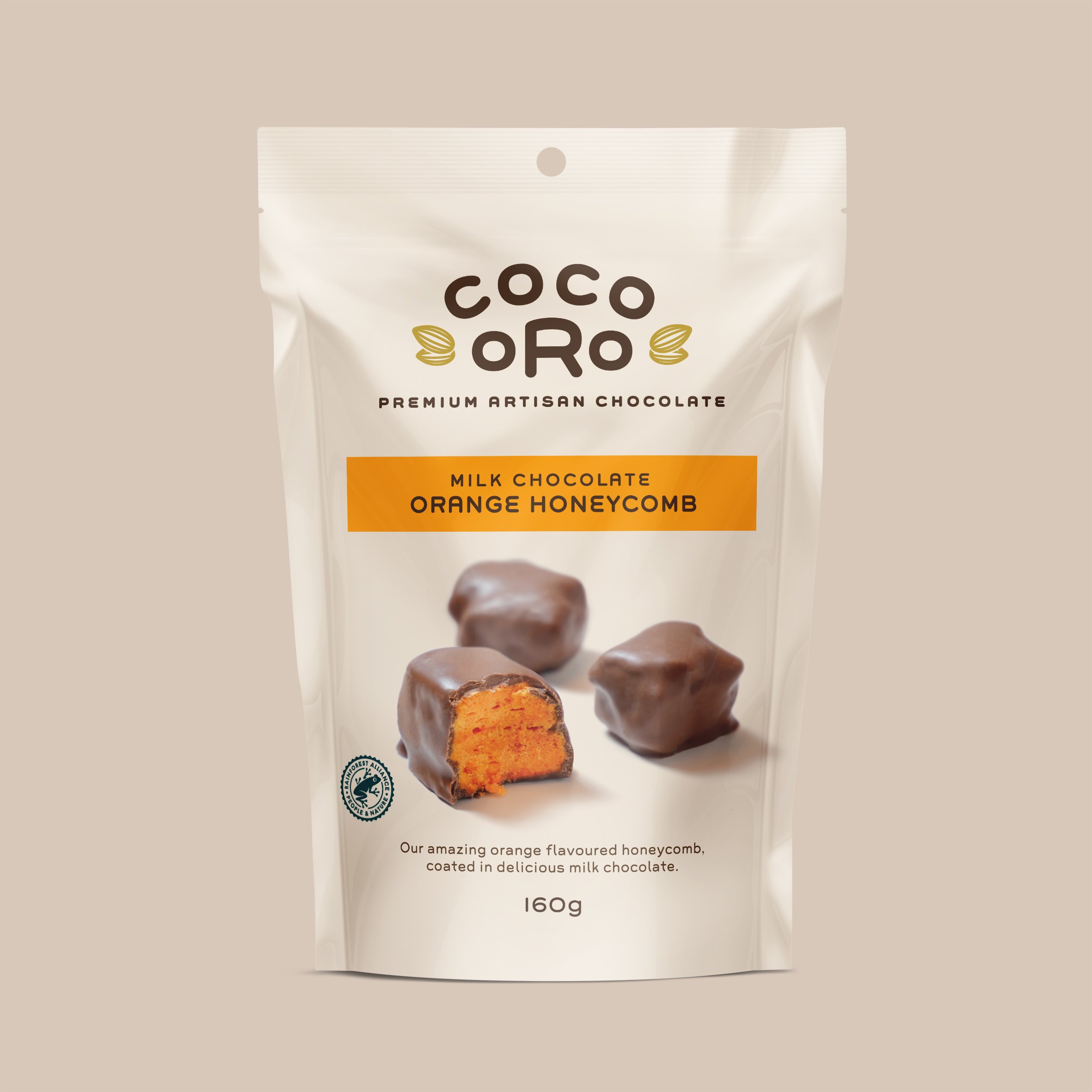
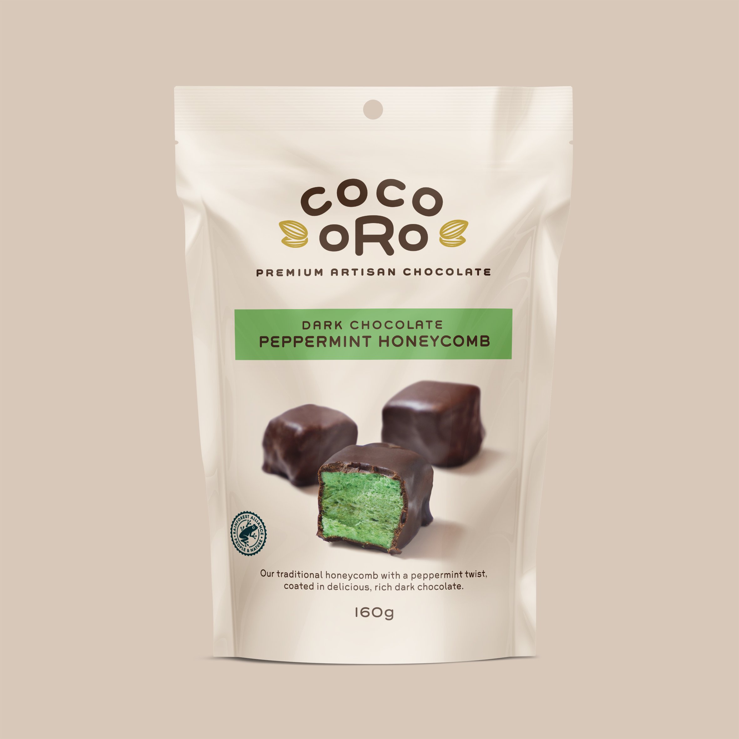
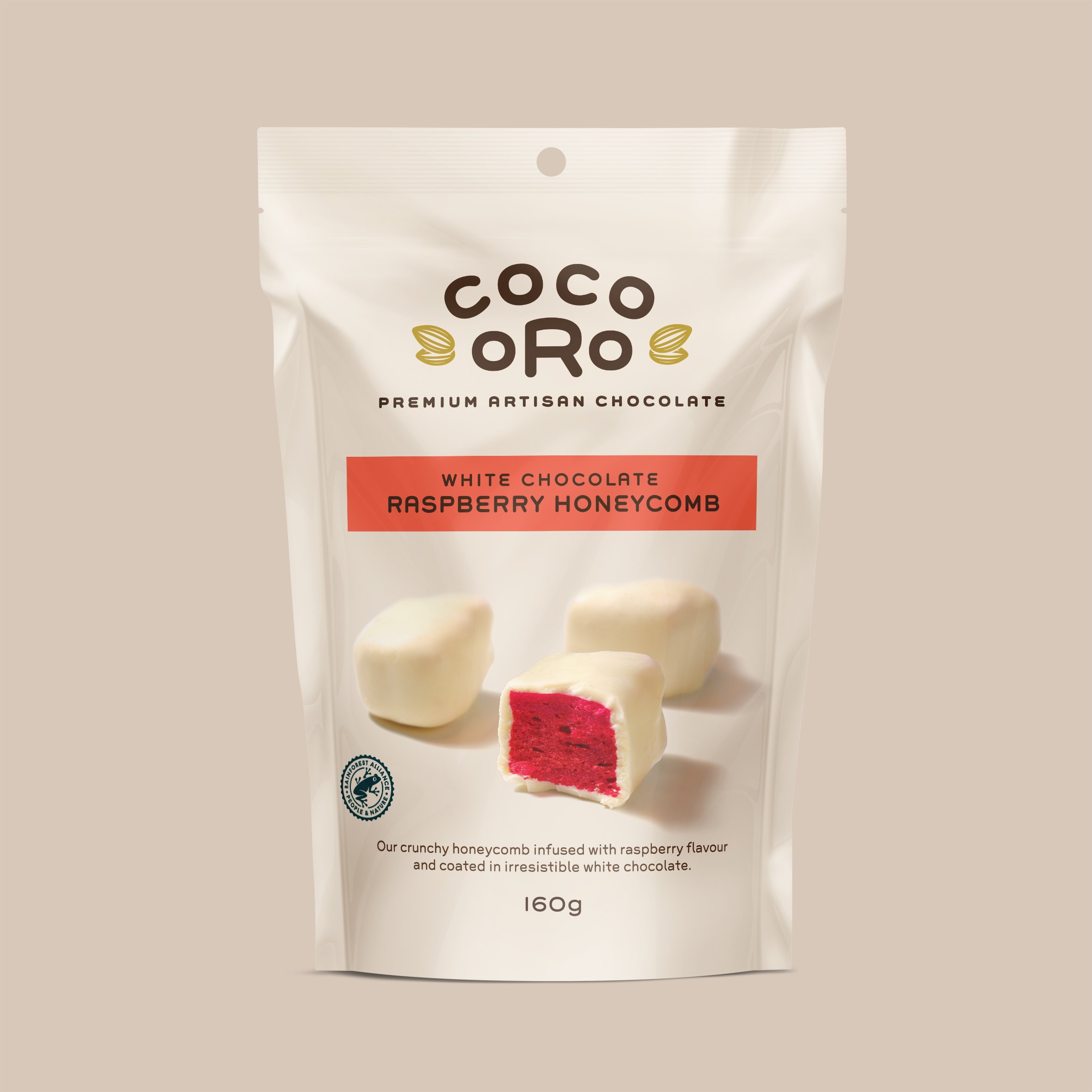
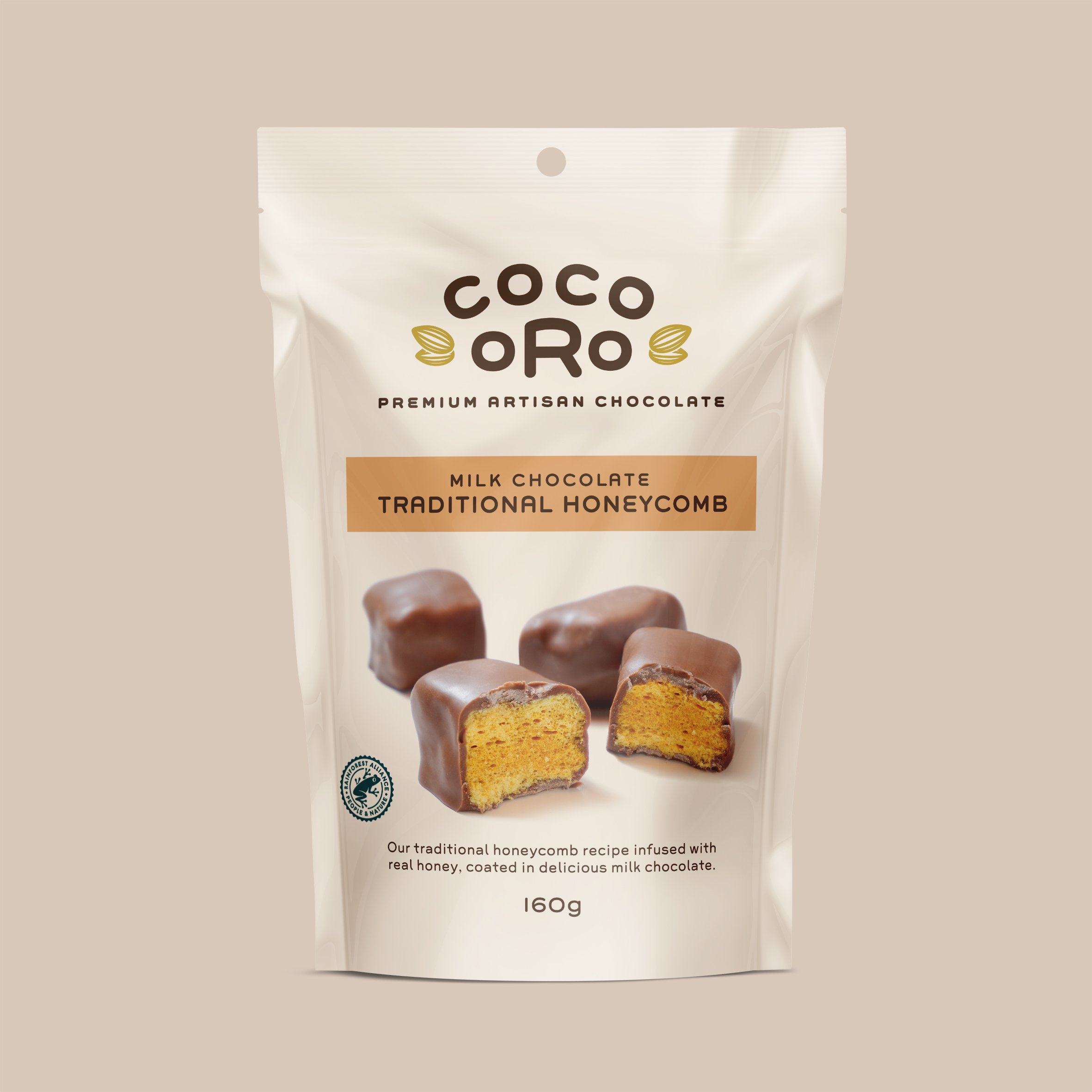
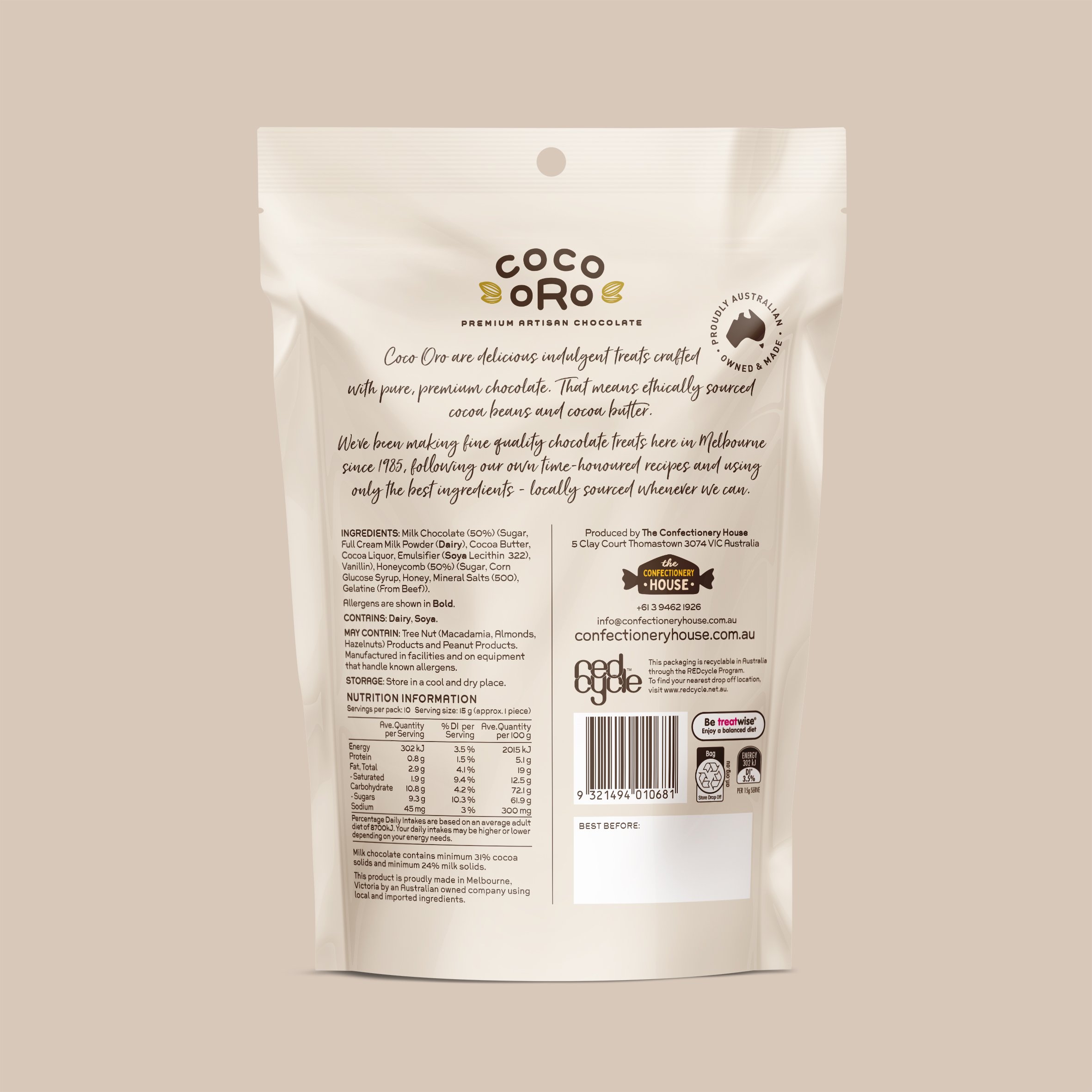
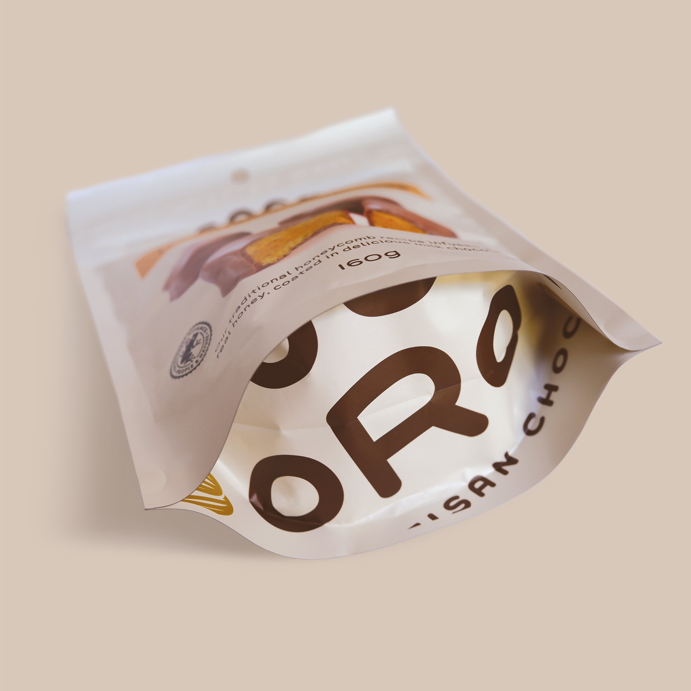
For The Confectionery House’s first foray into premium chocolate we named, then designed brand mark and packaging for this high-end chocolate honeycomb range. The brand is positioned as an artisan challenger brand – it’s point of difference being that it’s a contemporary, locally made offer with ethically sourced, high quality ingredients made using traditional, artisanal methods.
Our naming process led to a beautiful, simple and great-sounding name that immediately expresses the quality positioning of the brand. In bringing the brand and packaging to life, we used a minimalist and elegant aesthetic, deliberately juxtaposing traditional graphic style with a single, modern font. The bold and uncluttered product photography makes it the hero of the pack and ensures that taste appeal is the key motivator in consumer purchase intent.
Take a look at another project