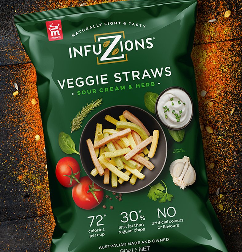
Infuzions
Brand Identity / Packaging
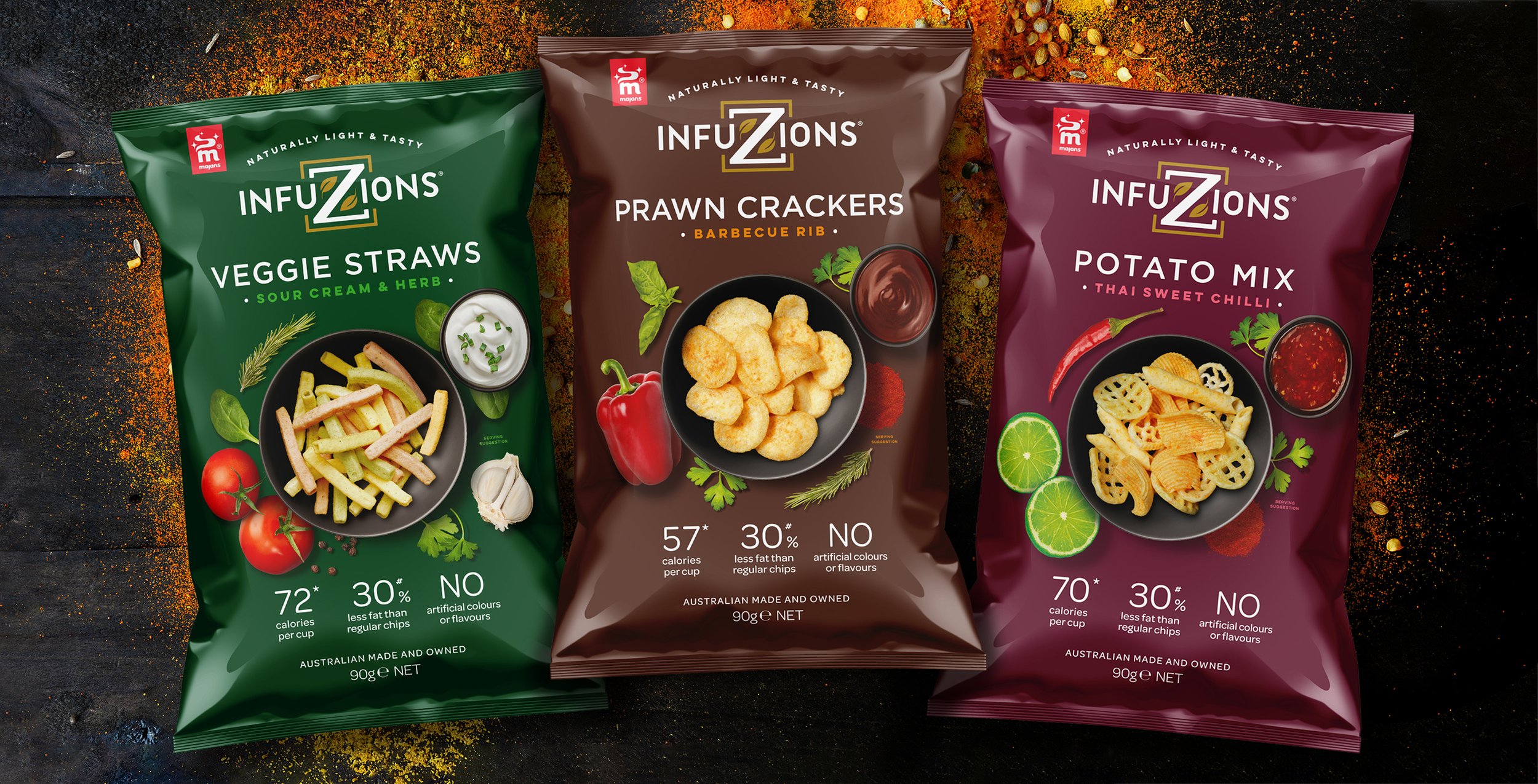
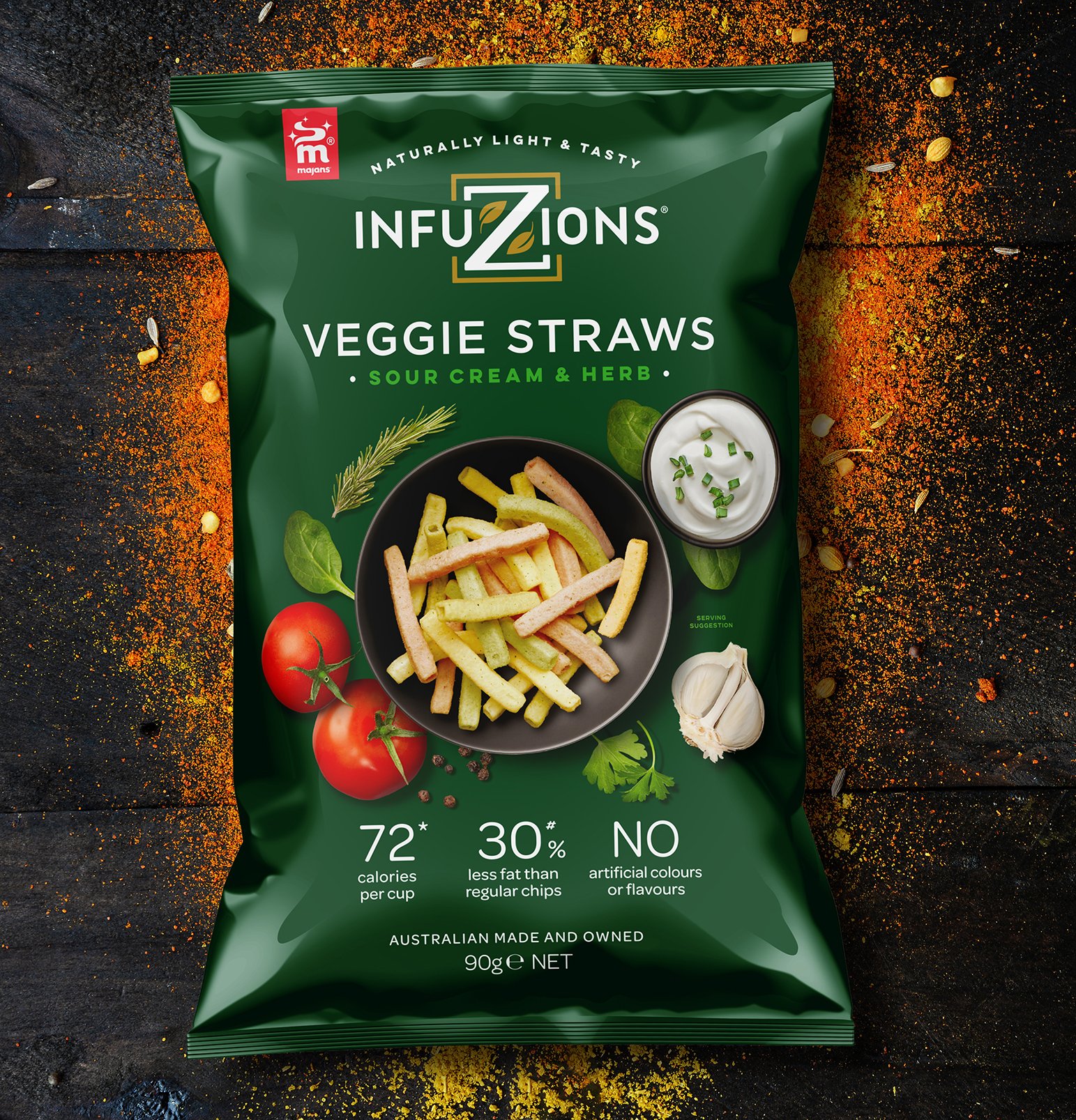
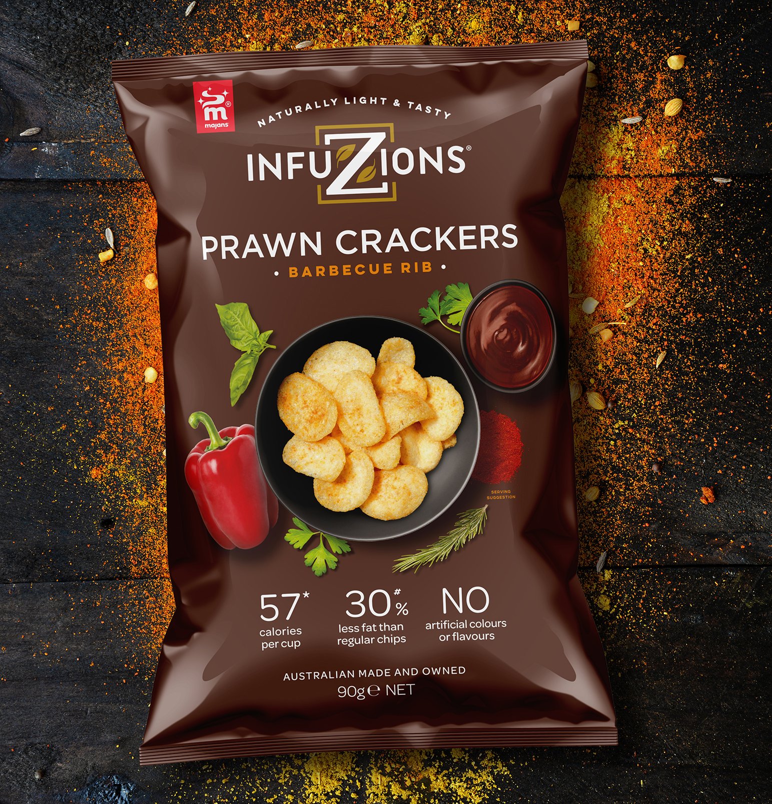
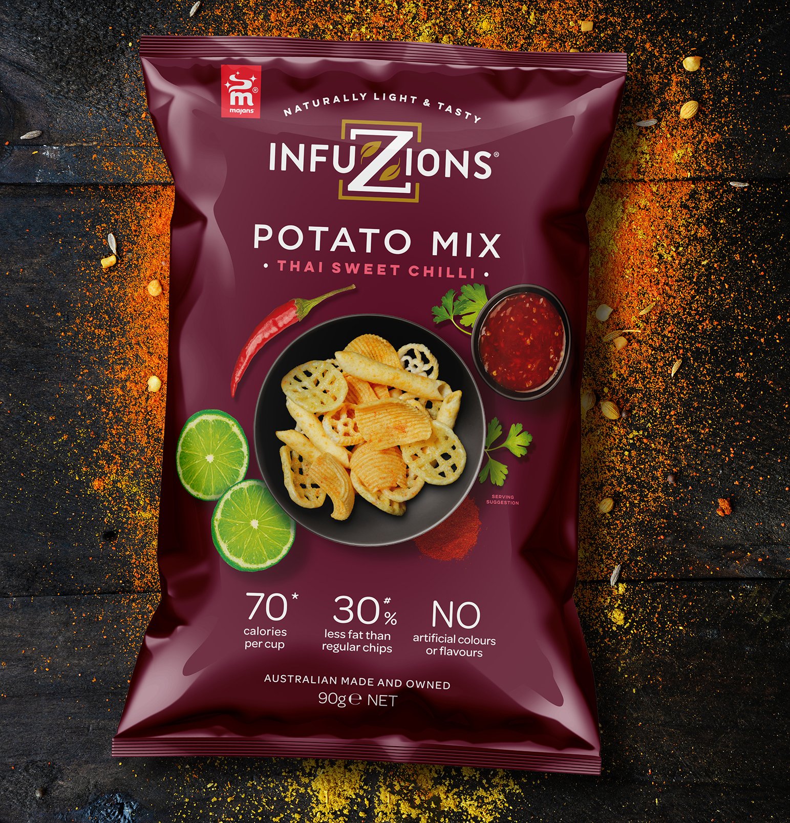
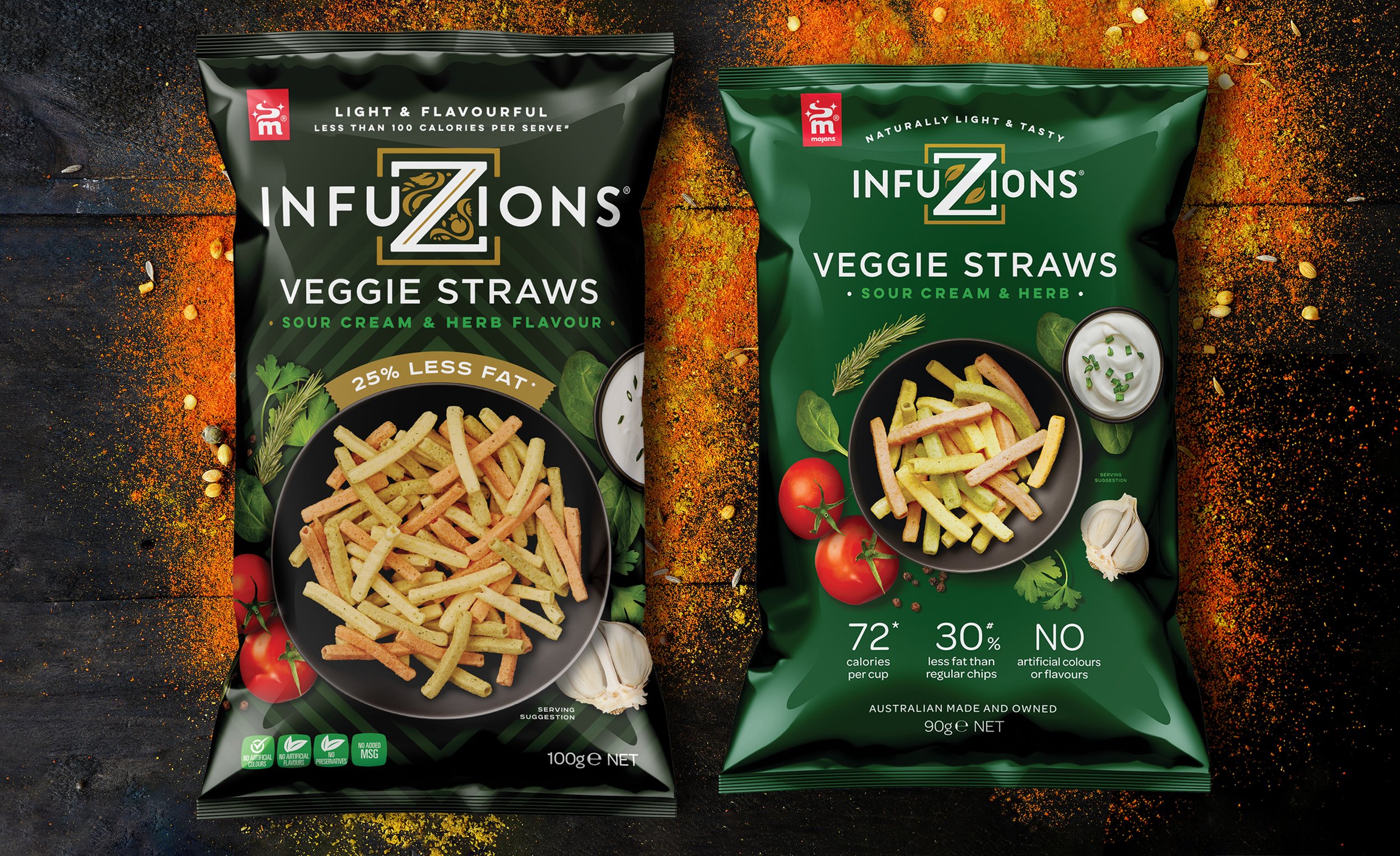
Our redesign of Majans’ Infuzions range of plant-based snacks took into account the brand’s longevity and popularity, while refocussing on what makes Infuzions unique and the changing dynamics of snacking in Australia.
Simplification, as graphic shorthand for brand confidence and quality, was our first goal. We created a better visual hierarchy and gave everything space to breathe.
Insights into the brand’s current consumers led us to redesign the brand mark and all messaging to be simpler, more direct and more health focussed – the brand mark is simpler, the branding hierarchy has more emphasis on the variant, the health claims are more prominent and distracting background vignettes and patterns have gone.
Reducing the size of the serving suggestion was not only more on-brand and socially responsible but meant we could improve taste appeal by better featuring the ingredient cameos.
Take a look at another project