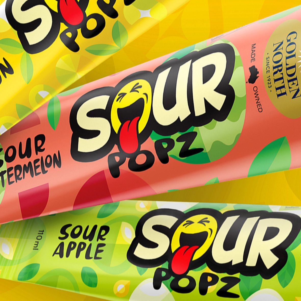
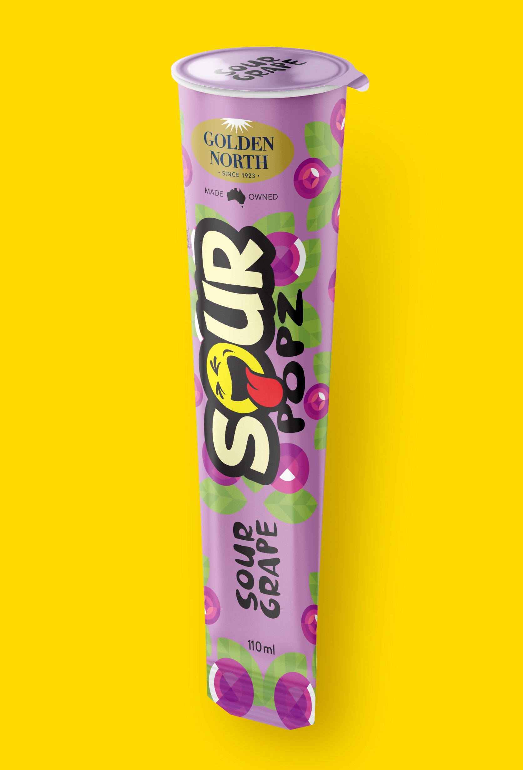
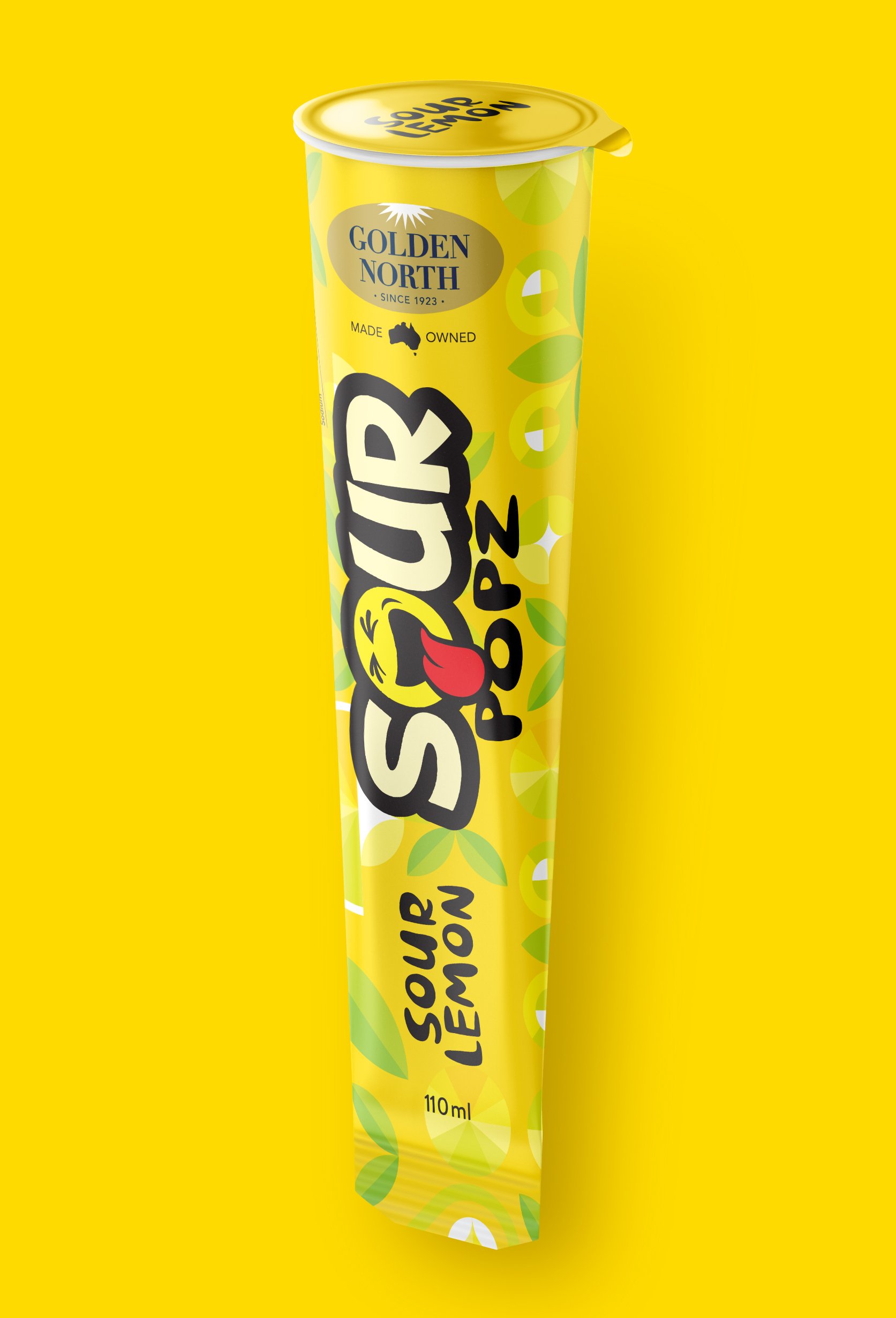
Sour Popz
Brand Identity / Packaging
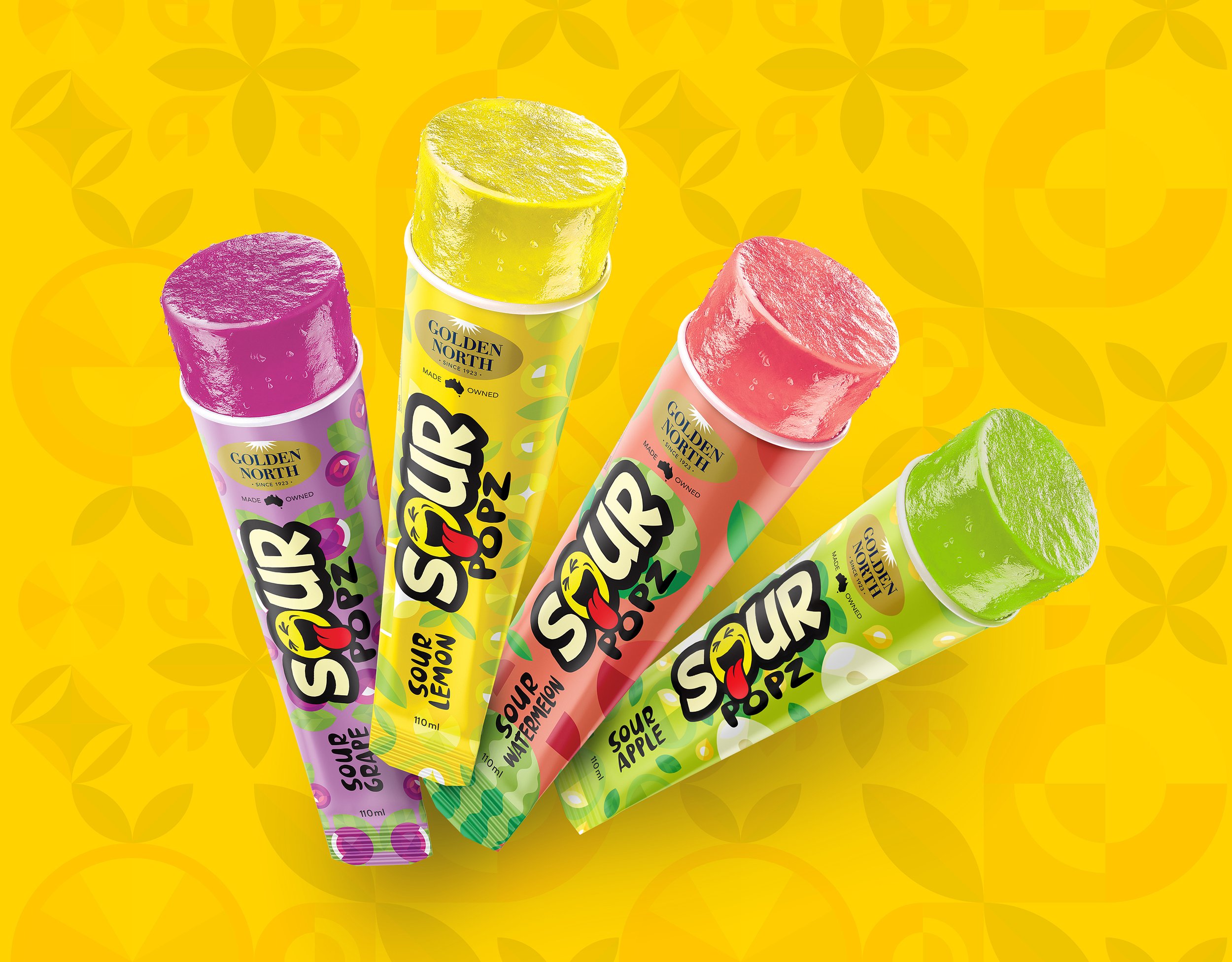
A spirit of innovation and a desire to grow the Golden North brand into new markets led to their clever new product, Sour Popz. With an innovative new product offer and a name that hinted at both excitement and flavour, Sour Popz promised to be a game-changer in the world of ice confection.
The complexities of branding a product to be sold both directly to a youth audience (convenience stores and school canteens) and to gatekeepers via mainstream retail were not lost on us. Some clever strategic thinking was required to develop a look and feel that spoke to both audiences without alienating either.
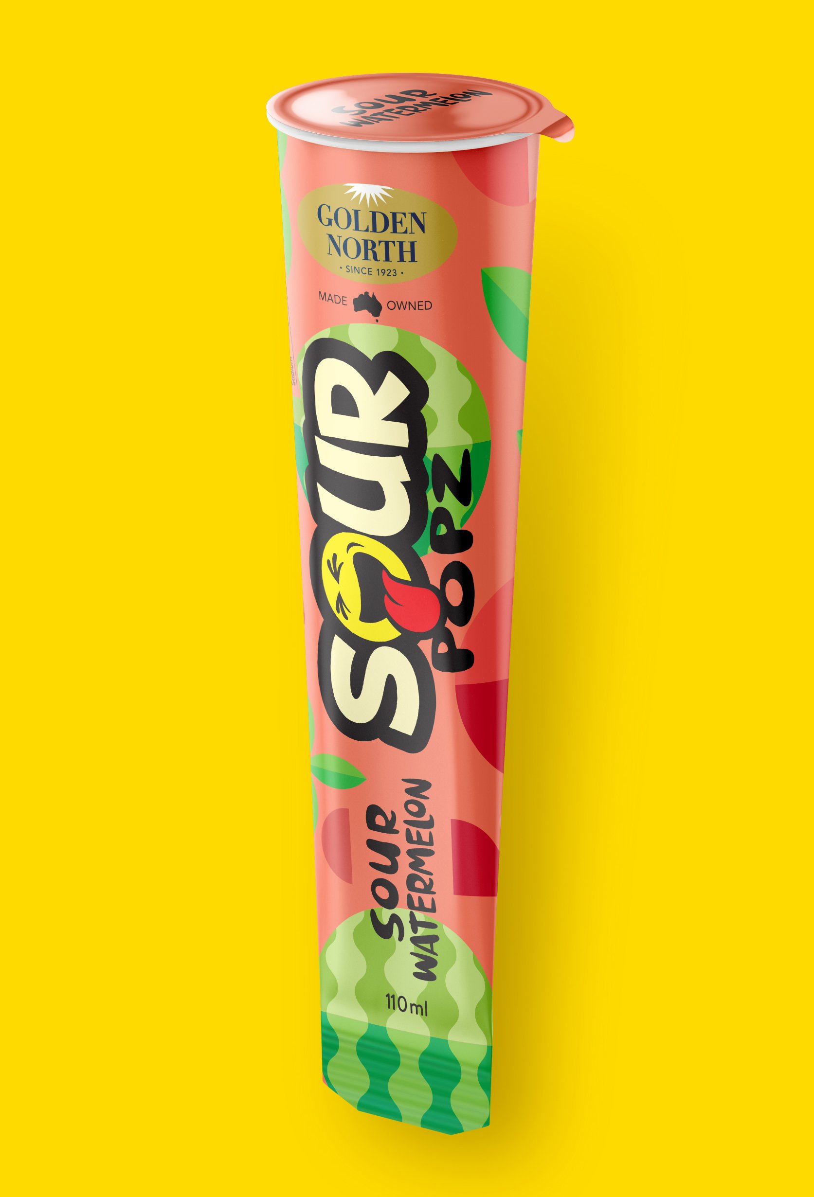
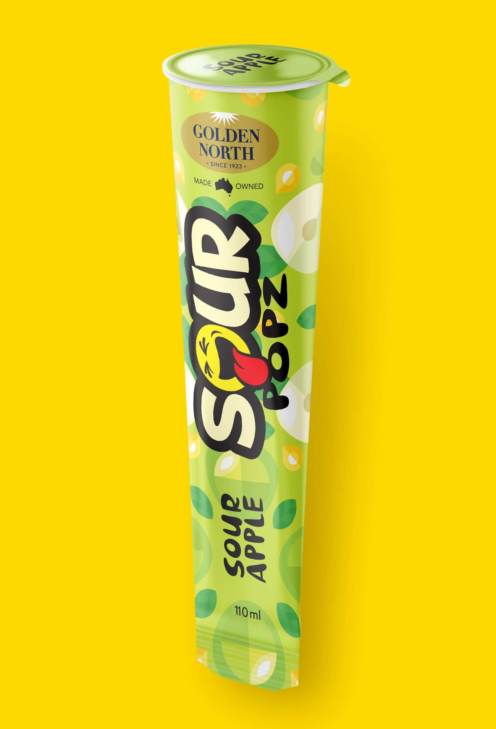
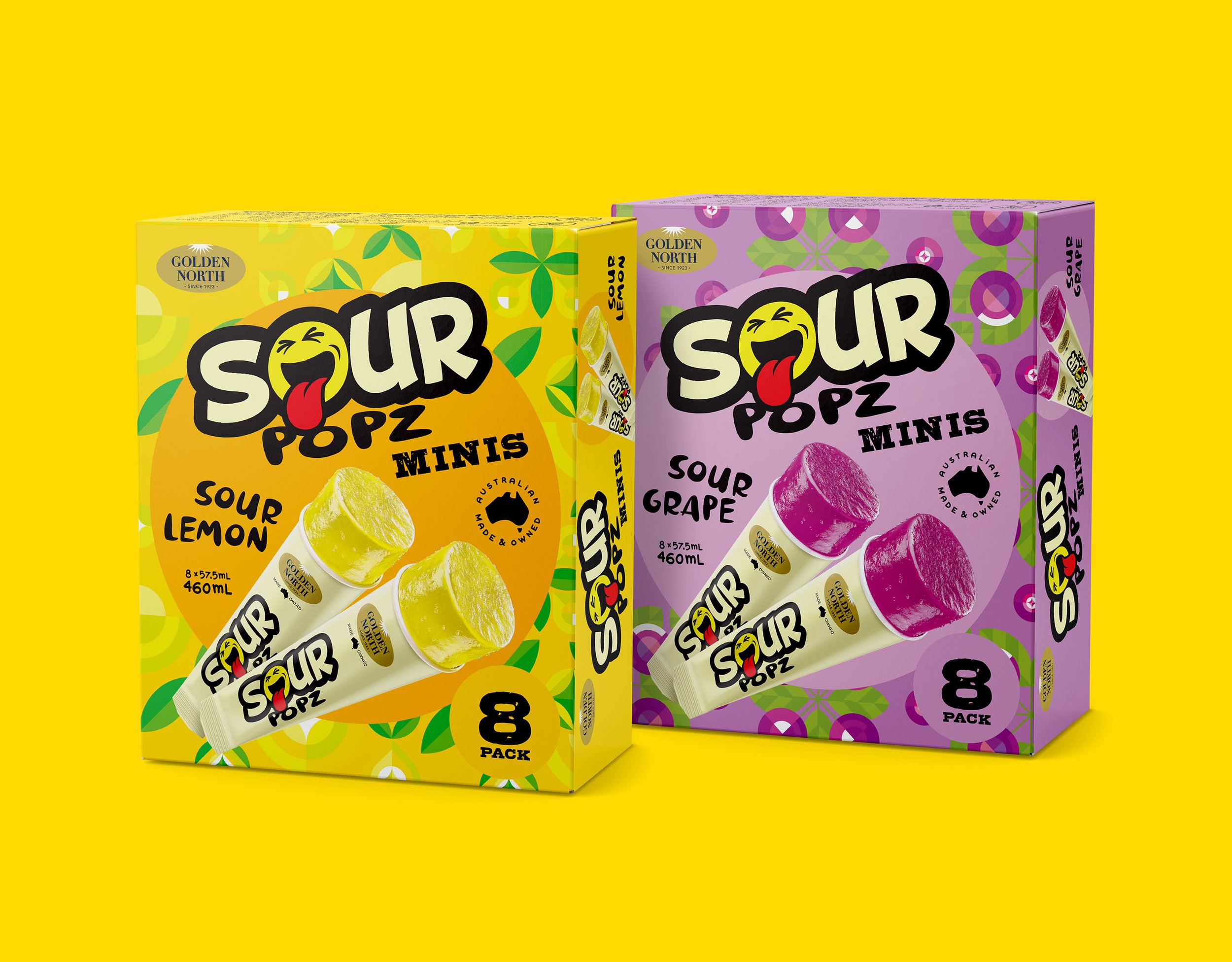
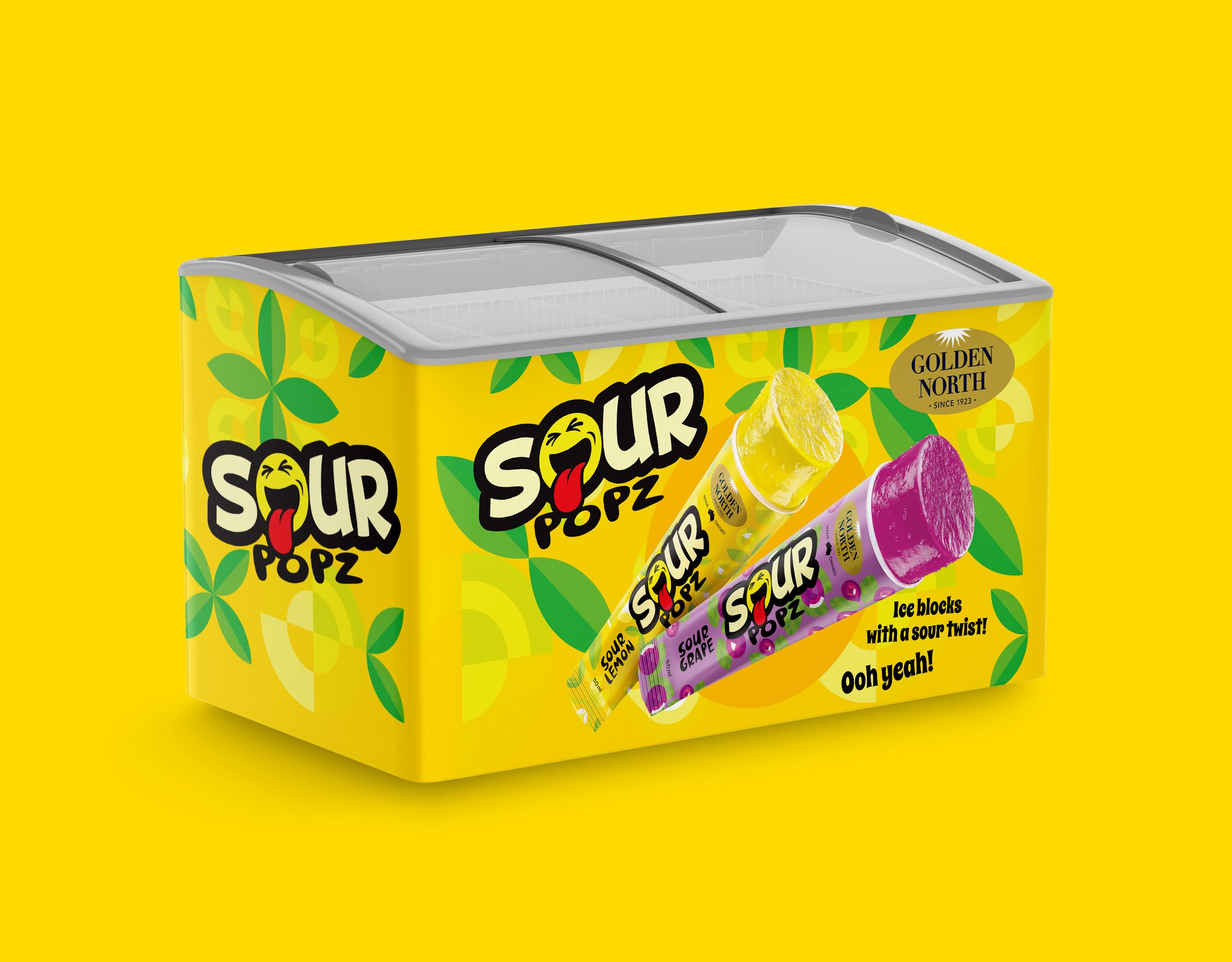
We struck just the right balance. We knew that elegance and nuance wouldn’t cut it, just as an edgy, over the top punk look wouldn’t either. The end result is a bold, no nonsense and broadly engaging brand mark referencing both street-art and emojis, but still with mainstream appeal. The packaging semiotics needed to be bright and dynamic - a promise of the enjoyment to be had inside. We developed a range of visually distinctive flavour-specific graphic patterns, loosely referencing each flavour but subtle enough to not overpower the brand mark.
What was launched as 2 products quickly became 4, as Golden North realised what a hit they had on their hands. An instant success, as sales surpassed all expectations within weeks of launch.
The combination of vibrant, eye-catching packaging and a truly unique product offer ensured Sour Popz’s success.
Take a look at another project